Advertising is an art form. Advertisers have only a matter of seconds to grab someone’s attention – whether it’s in print or online – and hammer home a message, product, or service. It’s very much the same for watches and indeed the watch industry has created some absolutely fantastic vintage watch ads over the years. Granted, they’re a bit slicker and more streamlined these days, but go back in time – flick through an archive of old magazines – and you’ll discover some that they go well beyond ‘just’ selling to you.
Of course, there are a lot out there and many, many more than we don’t have the time to sift through. So, we spoke to Ad Patina founder, Nick Federowicz, who has been hunting down some of the coolest vintage ads in the world for the past six years, for some of his favourites. If any catch your eye then don’t forget to head over to Adpatina to check out what else Nick has in stock.
Audemars Piguet Royal Oak, 1978
“AP, around this time did a lot of conversational ads, so it’s like an excerpt from a book or a screenplay. This ad is a great take on that. It works for something unconventional, when people might want to ask questions. So, it’s funny, speaks to the truth of the watch and it’s like talking to a friend that someone who doesn’t know about watches and is trying to wrap their head around why a Royal Oak is so expensive.”
Bulova Accutron, 1974
“I found this one loose, so I don’t know where it came from, but it’s a bold statement. If you picture people out on the street picketing, to get people’s attention for their demands, it has that kind of statement. It’s saying that women’s watches should be equal to men’s – which in the case of the Bulova’s price and accuracy, they are. It still speaks to equality today; it’s not about gender, it’s about the person. Or in this case, the watch.”
Cartier Must De Cartier, 1979
“I preach that Cartier is all about design and luxury and I feel like their ads are really romantically styled. The watches are always spotlighted and capture the mood of the brand. They work really well framed and on display with that kind of embedded sophistication. Whether it’s the simplicity, or the soft, delicate watches, they’re beautiful ads. It may have a watch, but it’s about an extension of the Cartier brand.”
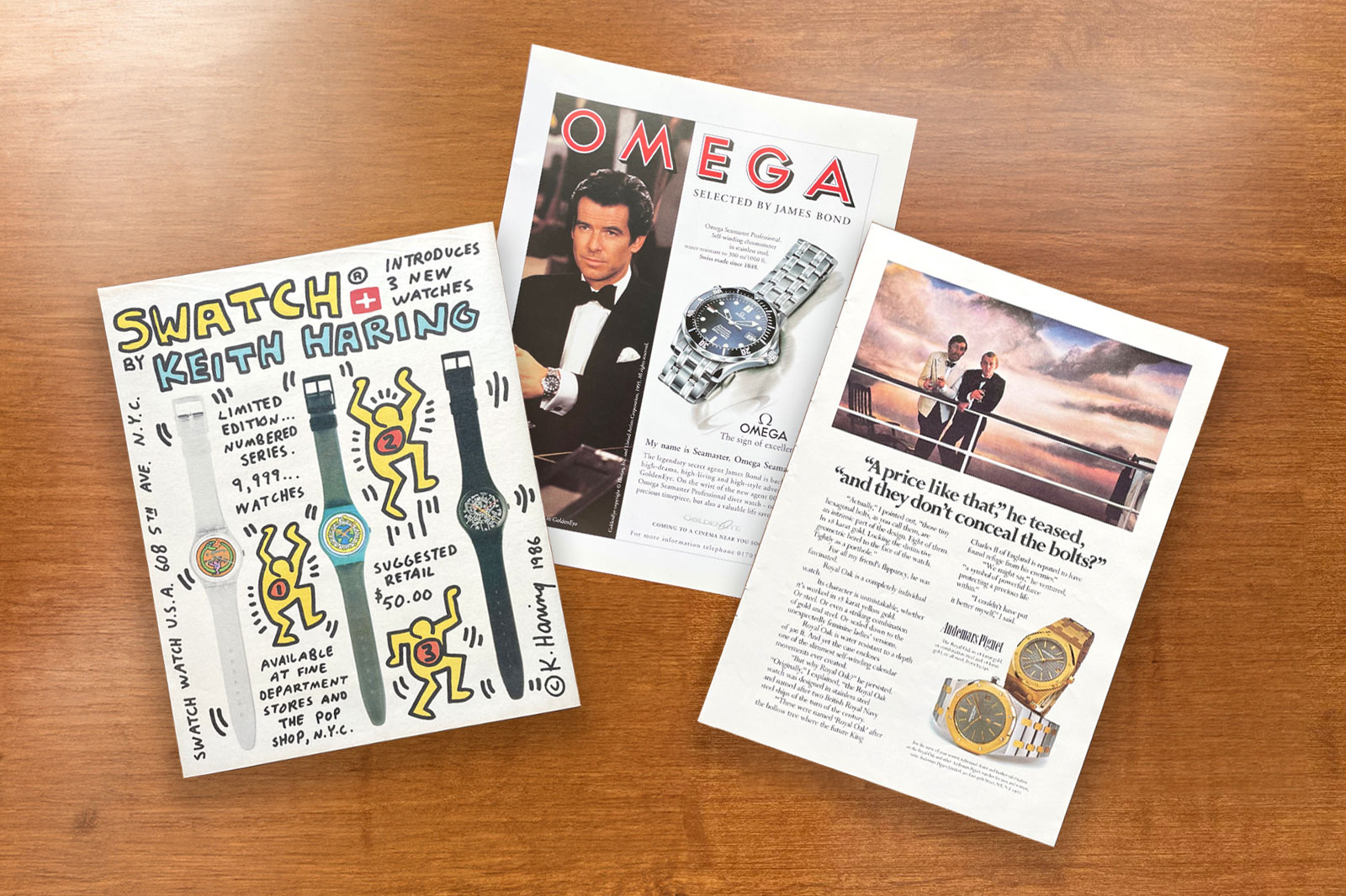
Omega Seamaster 300M, 1996
“GoldenEye was the first film in which Bond wore this watch and I’m in love with it. It’s an important ad to Omega’s history and I think it’s the reason a lot of people got hooked on the brand. It’s like a mini film poster and speaks to the business of the brand, and the marketing, but also the whole concept of watches in film and on influencers’ wrists. It’s part watch history, part movie history. When I source ads I try to always have some important ones like this.”
Patek Philippe Travel Time, 1999
“They began this campaign in ’96 and still do it today. I think it’s one of the most effective and well-known campaigns ever made by any brand. Even people that don’t know a lot about watches probably recognise it. You can probably find it being taught at a business school. It’s an emotional ad (the watch isn’t even in main image) and this one’s particularly sweet. You can wear it, you can live with it, and you can hand it down as an heirloom. These Patek ads are an art form and you can pick any of them as fantastic examples of watch ads at their best.”
Unviersal Geneve Polarouter, 1956
“This is one of my favourite ads ever. I don’t ever need to own a Polarouter to invest in framing this. It’s a great example of the elements that went into creating an ad from its era. There are more fonts than I can count; some in bold, some italicised, and there’s even some brand history with Polarouter spelled with an ‘a’. It’s about golden age aviation, with great illustrations and two logos. It has everything.”
“There’s so much to look at, so much information, and it can open up the door to learn more about watches, or the world at the time. What even is the DC-7C? I always find myself researching ads like this that encapsulate their era, to understand what was going on in the world back then. Not all ads are created equal and there are plenty of different Universal Geneve ads, but this one continues to stand out as the best. One of the best for Scandinavian Airlines, too.”
Rolex Day-Date, 1967
“These started in 1967 through to the early ’70s and this is a perfect example of Rolex advertising. Left aligned text, black background; it’s instantly recognisable and a design that lasts. You can spot these from a mile off and know it’s Rolex, even if you can’t see the watch. Some of them don’t make too much sense – firefighting with a day-date, stuff like that – as they were all more closely related. No ‘Daytonas are for racers’, just a point that all of their Oysters are suited to extreme conditions. This one though makes perfect sense – the Rolex President at the UN.”
Swatch Keith Haring Limtied Edition, 1986
“Swatch do a ton of collaborations today so I’m not sure where this lands in that timeline, but it’s a fun, artistic ad that’s obviously drawn by Haring himself. It’s one of those instances where you’re probably not going to own a genuine Keith Haring work and the watches pictured don’t last. This ad though is a bit of both. It’s cool, it’s vibrant, it’s very New York. It talks about the price, department stores, shows all three watches, is signed and dated. Everything about this ad is odd, bright and playful. Sure, it’s selling a watch but it’s an actual piece of art.”
More details at Adpatina.
Oracle Time