Posted on

RZE Introduce UTD-8000 a Titanium Watch with a Digital Heart

RZE UTD-8000

RZE UTD-8000

When looking at a watch like the Rolex Explorer or Tudor Black Bay Pro we all picture setting out on a wild adventure to the top of mountains, the bottom of caves or across the arctic but unless you’ve been sponsored to do so, it makes more financial sense to leave them nice and safe in your watch box at home. For genuine expeditions you want a watch that’s far more accessible, far more reliable and far more durable. Enter RZE and their new watch the UTD-8000, their first digital timepiece.

Let’s talk digital. Digital displays are actually a time honoured tradition in the realm of adventure watches. Just as on the mechanical side you have icons like the aforementioned Explorer, there are a huge number of famous digital adventure tool watches. Casio’s G-Shock immediately springs to mind as does the Breitling Emergency. There’s a good reason for these tool watches, including the new RZE UTD-8000, to be digital.

RZE UTD-8000

In the most simplified terms possible, digital displays have fewer moving parts than mechanical ones. There are no hands to snap off after a particularly jarring bump. There are no gear trains to be damaged by excessive vibration as you drive across a gravel path. And, arguably most important of all, the backlit LCD screen is super legible in all conditions. That’s particularly true of the UTD-8000 which has an oversize digital display for boosted readability.

The top portion of the display shows the day of the week, the centre is the time and at the bottom is the date. There are also additional modes that can be selected with the pusher at 7 o’clock, which include chronograph timer, alarm, hourly chime and format changes such as 12/24 hour time display. Around the edge of the digital display is a coloured ring that describes the various functions and which is available in a choice of yellow, black or blue.

RZE UTD-8000

Structurally, the RZE UTD-8000’s digital module is held in place by a compressible cushion material, protecting it from shocks inside the case. The case itself measures 41mm in diameter with the bezel overhanging slightly with a diameter of 42mm. Its thickness feels proportional at 13.4mm. As with all RZE watches it’s made from titanium, specifically grade 2, which provides great strength and lightweight properties ideal for adventuring. On the aesthetic side it’s suitably rugged looking with an industrial vibe courtesy of exposed screws and angular facets.

One of the major considerations in the creation of the UTD-8000’s case was weatherproofing. Whether you’re in the mountains or the arctic, protection from the cold and severe temperature fluctuations is important. Which is why RZE tested the watch in the Canadian tundra, exposing it to -30 degree Celsius temperatures for over 24-hours, as well as +60 degree temperatures for an hour. It survived them all with continuous operation. One of the most fun tests involved zip-tying it to the front of a car and blasting along at 100km/h (about 60mph for we Brits) to give it a real rattle test.

RZE UTD-8000

As for pricing and availability, the RZE UTD-8000 has a full MSRP of $219 on elasticised fabric strap or $369 on titanium bracelet (approx. £170/£290). However, the fabric strap edition is being launched in a two step process giving you the chance to get your hands on it as a significant discount. If you pre-order it between March 20th and March 31st there’s a special launch discount at $169, following which is the standard pre-order at $199 (approx. £130/£155). For a watch that will be by your side for the rest of your life (it comes with a lifetime guarantee) that’s quite the reasonable investment.

Check out the upcoming Issue 111 of Oracle Time Magazine in April for an interview with RZE’s Huiy Tang on the launch.

Price and Specs:


Model:
RZE

UTD-8000

Case:
41mm

diameter x 13.4mm thickness, titanium

Dial:
Yellow,

blue or black

Water resistance:
200m

(20 bar)

Movement:
Custom

UTD-8000 Advanced Multi-Function Digital Module

Functions:
Hours,

minutes, seconds, chronograph, alarm

Strap:
Elasticised

fabric strap or titanium bracelet

Price:
$169

(approx. £130) – fabric strap, launch price from March 20th-31st
$199 (approx. £155) – fabric strap, pre-order price
$219 (approx. £170) – fabric strap, RRP
$369 (approx. £290) – titanium bracelet, RRP

More details at RZE.

​Oracle Time 

Read More 

Posted on

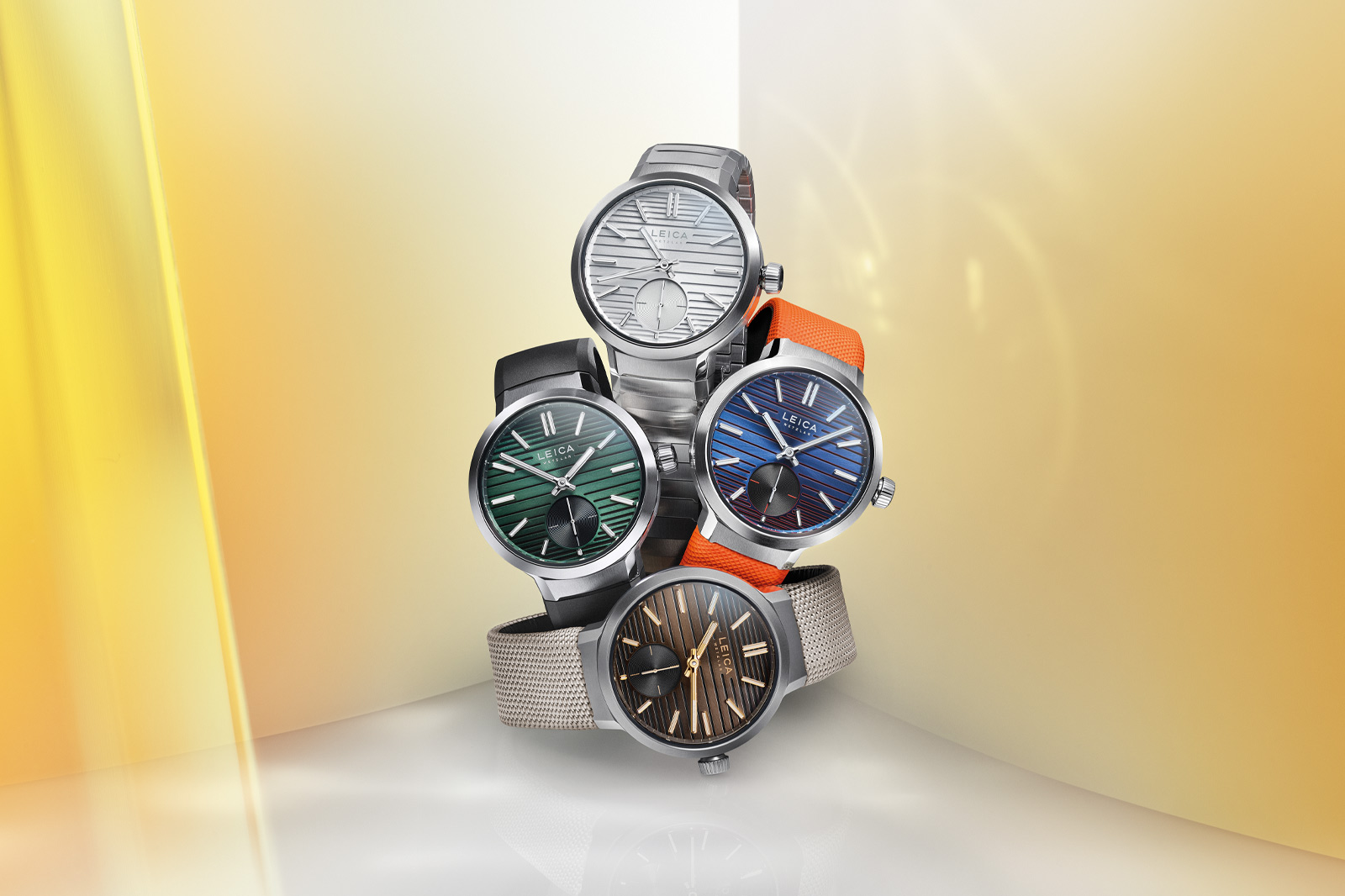
Leica Get Colourful with New ZM 12 39mm Collection

Leica ZM 12

Leica ZM 12

When I think about Leica’s watches, my mind immediately goes to the ZM 1 and ZM 2 whether in monochrome or with steel coloured accents. They’re dark, serious watches that reflect the intense focus and technological acumen of Leica as brand. However, when they released the ZM 11 they began to deviate away from the serious look with more colours and more extravagant styles. They’re building on that with the launch of a follow-up model, the Leica ZM 12.

Leica ZM 12
Leica ZM 12

The new watch has a 39mm diameter case with a circular design and gently sloped bezel. There’s an oversize crown at 3 o’clock making it easy to adjust the time and wind the movement. What stands out the most about it physically is the lugs, which are quasi-integrated. They’re formed by single, wide, flat bars that emerge from the case at 12 and 6 o’clock that then lead into the steel bracelet, technical textile strap or rubber strap. The scale-like pattern of the bracelet reminds me of the H. Moser & Cie. Streamliner.

Leica ZM 12

The dial features the same dual layered texture as the ZM 11, with the addition of a small seconds subdial at 6 o’clock. In terms of colours there’s Blue Orange, Silver Grey, Olive Black and Chocolate Black. Notably the first three of those are in steel cases while the Chocolate Black is in titanium, which you can tell from its matte finish and darker grey tone.

The Blue Orange is the most colourful design Leica have made to date and the vibrant colours give the watch a particularly energetic, sporty vibe. In contrast the Chocolate Black feels very luxurious, like the wooden teak flooring of a boat, similar to the texture found on the Radiomir Eilean from Panerai. That luxe vibe is heightened by the rose gold-coloured accents of the hour markers and hands.

Leica ZM 12

Beneath the surface is the automatic Leica Calibre LA-3002, produced in close collaboration with Chronode. It has an accuracy of -4/+6 seconds per day and a power reserve of 60-hours, which are really solid specs. It’s also been tested in five positions ensuring a high level of precision, similar to the tests undertaken by chronometers.

Leica ZM 12

In terms of pricing and availability, prices sit between £5,735 – £6,865 depending on the colourway and strap combination and they’re being released in two waves. The first wave consists of the ZM 12 Steel Silver Grey, ZM 12 Steel Olive Black and ZM 12 Titanium Chocolate Black, which will be available from February 27th at Leica boutiques, their online store and authorised retailers. The second wave is the rather lonely ZM 12 Steel Blue Orange being released in April.

Price and Specs:


Model:
Leica

ZM 12

Case:
39mm

diameter, stainless steel or titanium

Dial:
Blue,

silver, brown or green

Water resistance:
100m

(10 bar)

Movement:
Leica

calibre LA-3002, automatic, 38 jewels

Frequency:
28,800

vph (4 Hz)

Power reserve:
60h

Functions:
Hours,

minutes, seconds

Strap:
Textile,

rubber or stainless steel or titanium bracelet

Price:
£5,250

(blue orange, silver grey and olive black), £5,700 (chocolate black)
Rubber strap – £475
Fabric strap – £660
Clou se paris strap – £600/£645
Stainless steel bracelet – £990
Titanium bracelet – £1,165 (chocolate black only)

More details at Leica.

​Oracle Time 

Read More 

Posted on

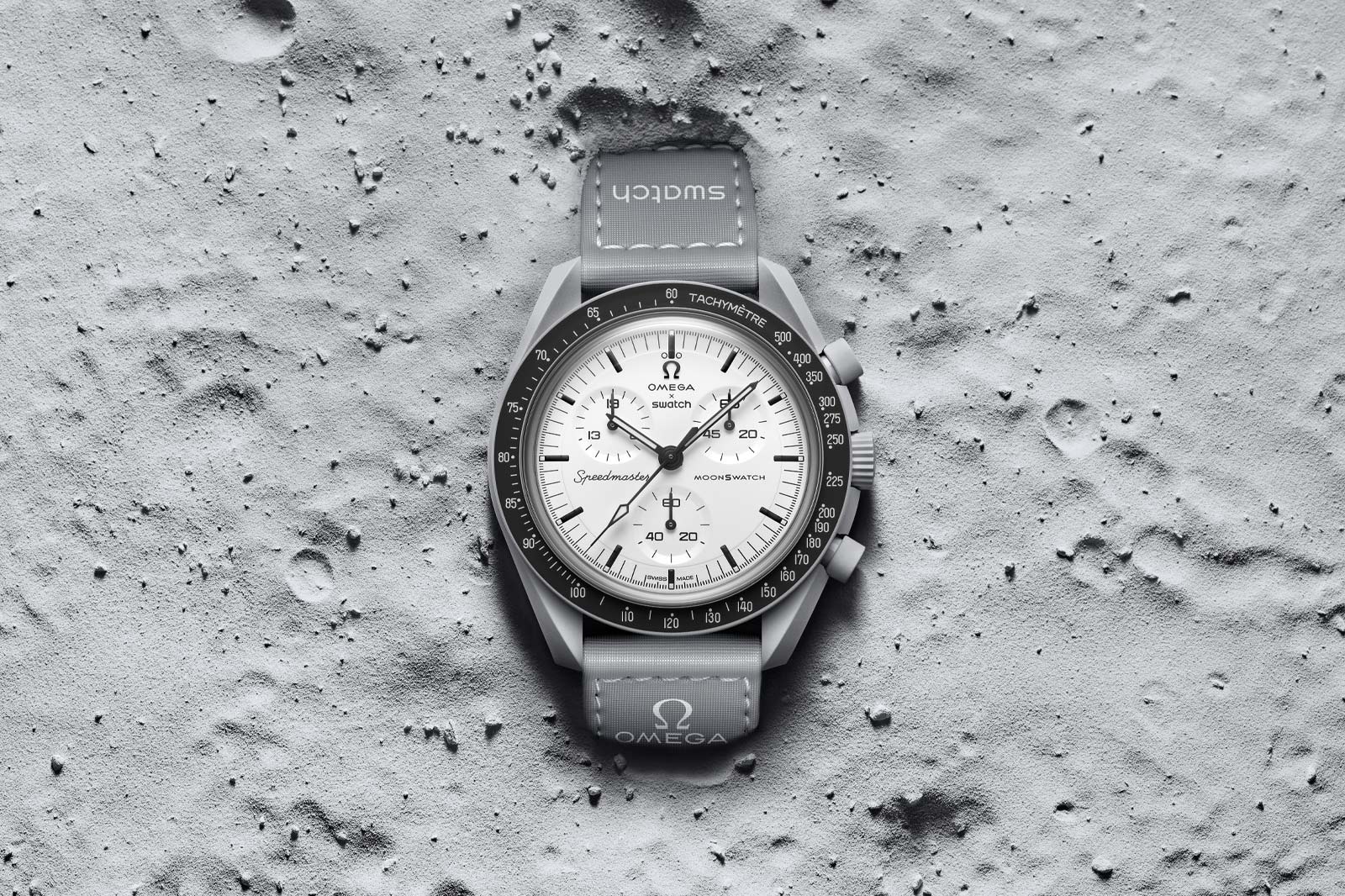
Swatch x Omega Release MoonSwatch 1965 Inspired by Original NASA Tests

Swatch x Omega Moonswatch 1965

Swatch x Omega Moonswatch 1965

At this point I shouldn’t need to explain what the MoonSwatch is. There have been enough of them over the three years they’ve existed – though I will throw up my hands and say I need to update our Complete Guide to Every MoonSwatch as there are a couple of new releases that aren’t yet included such as the Earthphase from the end of last year, and now this, the MoonSwatch 1965.

Swatch x Omega Moonswatch 1965

As the name suggests, this MoonSwatch is inspired by the Omega Moonwatch from 1965. Or to be more specific, the Omega Speedmaster, as it wasn’t until 1969 and the first moon landing that the model earned the moniker Moonwatch. However, it wasn’t by random chance that Neil Armstrong and co. were wearing Speedmasters. Back in 1965 NASA put out a call to watch brands to submit watches for NASA flight qualification and the Speedmaster was the only one to receive the qualification. It’s this qualification that the MoonSwatch 1965 is paying tribute to.

Swatch x Omega Moonswatch 1965

Ironically, while in name the MoonSwatch 1965 refers to some of the oldest Speedmasters, in terms of design it’s actually strikingly similar to one of the newest. Almost exactly a year ago Omega released the Ref. 310.30.42.50.04.001, a white, lacquer dial model that took the watch world by storm thanks to its really clean design – so much so that you all voted for it as the Best Chronograph of the Year in the 2024 Oracle Time Watch Awards.

Swatch x Omega Moonswatch 1965

What that means for the MoonSwatch 1965 is a white dial with slightly recessed chronograph subdials paired with black hour markers and hands that match the black tachymeter bezel. Notably the subdial at the 10 o’clock position has the numeral 19 on it and the subdial at 2 o’clock has 65, because they are actually a 19-hour counter and a 65-minute counter, together denoting the year 1965. Zooming out, the 42mm case is made from grey bioceramic, which is designed to essentially represent a matte version of the Moonwatch’s steel case.

Swatch x Omega Moonswatch 1965

It’s equipped with a quartz chronograph movement because that’s what allows Swatch to calibrate the chronograph timers to their unusual scales. It also helps to make the watch characteristically accessible, priced at £240. As with all MoonSwatches in the UK it’s exclusive to Swatch brick and mortar boutiques with a limitation of one per day per person. The full list of participating boutiques is available on the Swatch website. It’s kind of odd because while the MoonSwatch hype has died down dramatically compared to two-three years ago, between releases like this and the Earthphase model, they’re actually making the most interesting versions yet.

Price and Specs:


Model:
Swatch

x Omega Moonswatch 1965

Ref:
SO33M106

Case:
42mm

diameter x 13.25mm thickness, grey bioceramic

Dial:
White

Water resistance:
30m

(3 bar)

Movement:
Quartz

Functions:
Hours,

minutes, seconds, chronograph

Strap:
Grey

velcro with contrasting white stitching

Price:
£240,

available from selected Swatch stores in worldwide from 1st March

More details at Swatch.

​Oracle Time 

Read More 

Posted on

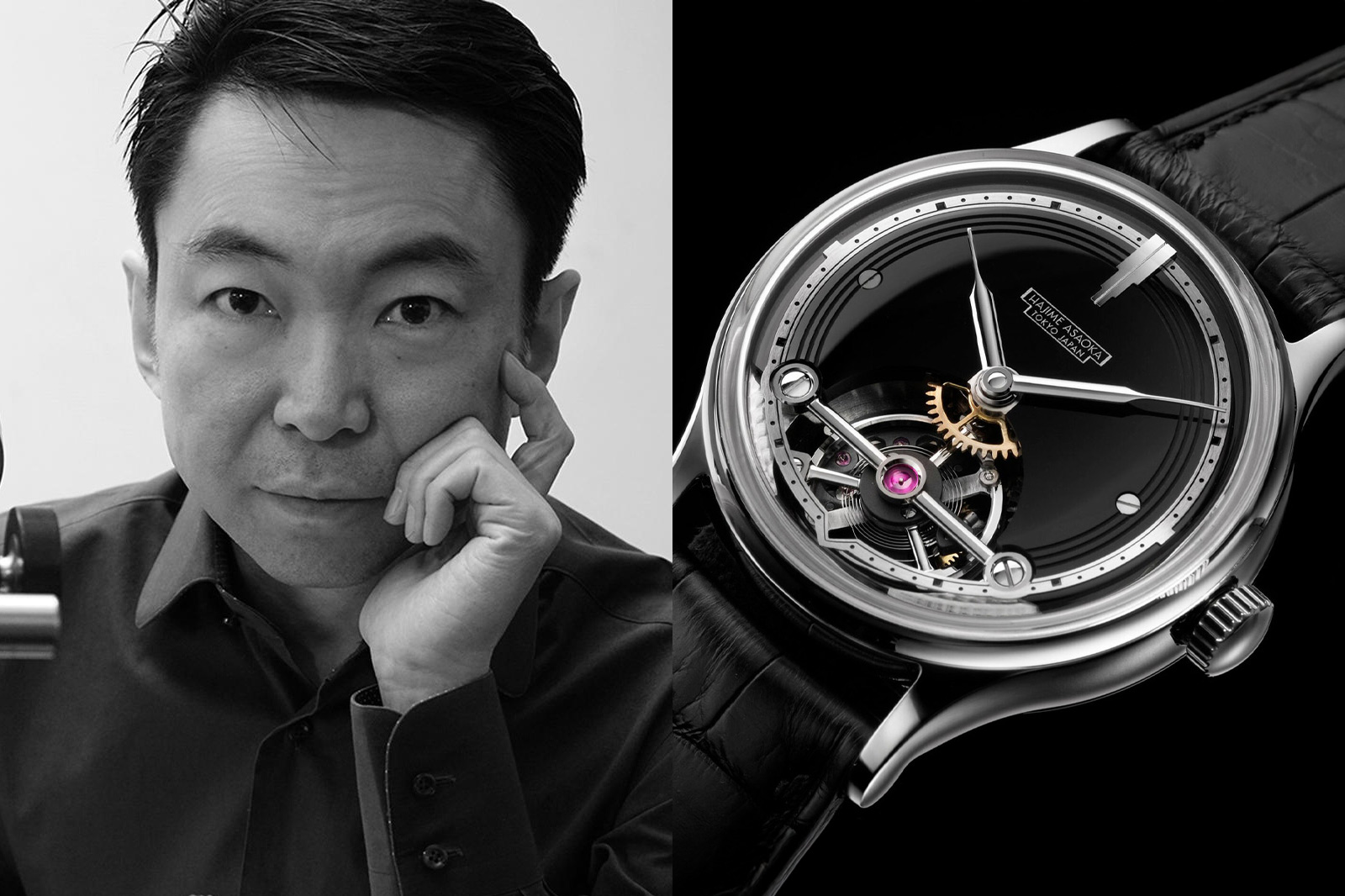
Hajime Asaoka: The Vanguard of Japanese Independent Watchmaking

Hajime Asaoka

Hajime Asaoka

I love Swiss watchmaking and will shamelessly wave the horological Union Jack. I also deeply respect the resurgence of US craftsmanship and Singapore-based micro-innovation. However, something about the Japanese’s profound focus on perfection sets them apart. Hajime Asaoka, with his growing bouquet of brands, proves the point. And Asaoka-san remains arguably the most influential living Japanese independent watchmaker.

Today, there is an increasing love of independent watchmaking. To the point of F.P.Journe pieces beating the other Swiss über-brands at the gavel at big auctions. This can even be seen as a reason for calming down the stratospheric value surges for Pateks and Rolex watches as the collecting community at large reassess. Diversification is at the heart of my collecting joy, and it seems many other now have the same sentiments. So how are Japanese independents different, and what does Hajime Asaoka in particular offer?

Hajime Asaoka Tourbillon Noir

Hajime Asaoka Tourbillon Noir

Hajime Asaoka is renowned for his exquisite craftsmanship and Art Deco-infused avant-garde designs. His watches, such as the Tourbillon Noir and Tsunami, are celebrated for their fusion of traditional horology and modern aesthetics. Asaoka-san hails from Kanagawa prefecture in Japan and received his education in product design from the Tokyo University of the Arts, but without touching on watchmaking. Plus, without the strength of being born into a Swiss family of watchmakers, when he did turn his attention to the craft his perspective brought something different to any other watchmaker: a fresh, objective view.

Asaoka’s journey to becoming a self-taught watchmaker all started by reading the iconic George Daniels book Watchmaking. On top of which he watched YouTube tutorials on how to use machines he bought from eBay. Even considering the factor of Japanese self-discipline and perfectionism, Asaoka-san’s story stands out. From his debut in 2005 as an independent watchmaker, it took him only four years to develop an in-house tourbillon. This was the Tourbillon #1 prototype. It led to a membership in the Académie Horlogère des Créateurs Indépendants (AHCI), a Swiss-based organisation dedicated to fine handmade independent watchmaking. Hajime Asaoka is one of only two Japanese members and will exhibit in Geneva at this year’s AHCI event during Watches and Wonders.

Hajime Asaoka Tsunami

Hajime Asaoka Tsunami, image credit: Phillips

Following from there is arguably the most well-known of Hajime Asaoka’s limited creations, the Tsunami, which stands out as a classical 37mm dress watch. It is imbued with monochrome Art Deco cues, a trademark of Asaoka-san. The strong graphic expression features a a distinct ‘tuxedo’-style dial within a Calatrava-like case, a stepped bezel and a magnificent balance. Turn the Tsunami around and you’ll be faced with the 15mm of oscillating balance in all its glory. This is matched to an extra-large mainspring barrel and a distinct, clean movement aesthetic. All movement components have been manufactured in-house in Hajime Asaoka’s Tokyo workshop, and it’ll take on any strong Swiss piece in the horological ring.

Hajime Asaoka Tsunami Art Deco

Hajime Asaoka Tsunami ‘Art Deco’

For 2024, the Tsunami ‘Art Deco’ underlined its elegant inspiration with a vibrant blue and a striated dial centre that got it nominated for a GPHG award. In fact, Asaoka-associated Otsuka Lotec was one of the two other Japanese nominees, with Jiro Katayama taking home a prize for his steampunk-luxe No.6. It goes to show how over the years Hajime has spearheaded a Japanese contingent of independent watchmakers who have followed his path to global success.

In 2025, Hajime Asaoka’s Art Deco touch will become remarkably literal with the Montre a Tact (at time of writing still in the concept stage), unusually missing a crystal. The bezel appears almost flush with the case edge, with relief and raised polished numerals that transcend aesthetic purpose. Instead of a dial, there is a rotating chapter ring with a raised dot for hours, encircling a centre disc. This has a totemic raised minute hand with a distinct architectural flair. It is a watch that offers a unique perspective on watch design, inspired by a Breguet pocket watch. One that could be read in the dark by tactility alone, and of course, for the blind and visually impaired – similar in concept to Eone.

Hajime Asaoka Montre a Tact

Hajime Asaoka Montre A Tact

Asked about his new creation, Hajime Asaoka tells me: “This year’s new model is the Montre A Tact. It is watch that allows you to tell the time by touch. The design incorporates features to ensure that the movement is not damaged even if they are touched forcefully. When arranging it, I made the pivot shaft of the watch hands very thick and supported it with a strong ball bearing. I also added a minute hand to improve its practicality. The Montre A Tact’s hands are vulnerable to being knocked out of alignment, a problem my new watch solves with a self-correcting mechanism. The images are design proposals, and the watch that is made may be slightly different.”

As CEO of Precision Watch Tokyo Co., Asaoka-san has developed two other mid-priced brands, supporting Jiro Katayama’s Otsuka Lotec. Kurono Tokyo has an increasing number of collectors who want to be a part of its club-like atmosphere. Ironically, the Kurono (phonetical enunciation of Chrono in Japanese) Tokyo brand was created by Asaoka for a simple reason. To afford him to wear his own designs. Kurono Tokyo offers strong quality in the £2,000-£4,000 segment with movements from Seiko and Miyota, and you will easily be pulled in by the Japanese craftsmanship. Add a low-production rarity which makes you feel part of a friendly Japanese gentleman’s club, and it is easy to see the appeal.

Kurono Tokyo Grand Urushi Aoyama Edition

Kurono Tokyo Grand Urushi Aoyama Edition

There is a vast distance in price between Kurono Tokyo and Asaoka-san’s £100K creations. However, distinct similarities are present, with an understated elegance and the characteristic flavour of Japanese culture. The dynamic, soft lines of the 34mm to 38mm cases usually have a fully polished finish, emphasising sleek ergonomics. With polished feuille hands on a mocha-tinged lacquered dial, my Grand Urushi Aoyama Edition above is a distilled example of the brand. Like many of the Kurono dials, its depth comes from the traditional technique of hand-applied Urushi lacquer. This is extracted and refined from tree sap in minute quantities, giving a deep gloss similar to Grand Feu enamel. The dial production has a high fail rate and weeks of drying time before assembly.

Kurono Tokyo Chronograph 3 HISUI

Kurono Tokyo Chronograph 3 HISUI

All watches by Hajime Asaoka have a discreet charm, strong dial art and sizing that makes for instant wearability. Within his Haute creations, there is a strong emphasis on traditional craftsmanship. Hajime Asaoka’s love of big balance wheels are a vivid reminder of the life within, an always mesmerising detail. With this year’s Montre a Tact project, we will see a new side to Asaoka-san. But it is one that still leans on an evocative and un unusual Art Deco aesthetic. Even the experimental Montre a Tact has an Asaoka signature. And it is one that that grabs your attention with the smallest of details. And for a regular watch lover whose budget remains under the mid-priced £5K ceiling, his sub-brand Kurono Tokyo offers a lot. Even for the most astute collector of wristwear.

More details at Hajime Asaoka.

​Oracle Time 

Read More 

Posted on

Audemars Piguet Launch 150th Anniversary Perpetual Calendar Collection for 2025

Audemars Piguet Code 11.59 Selfwinding Perpetual Calendar and Royal Oak Selfwinding Perpetual Calendar

Audemars Piguet Code 11.59 Selfwinding Perpetual Calendar and Royal Oak Selfwinding Perpetual Calendar

Audemars Piguet are kicking off their 150th anniversary celebrations in a big way by releasing a brand new in-house perpetual calendar movement for 2025, the 7138. It combines several of their past innovations with the specs of the calibre 7121 but the ultra-thin profile of the 5133. It’s presented in a trio of watches, two Royal Oak 41mm editions and a Code 11.59. At the same time the calibre 5135 is being retired with a final limited edition skeleton Royal Oak. AP have also released a handful of other Code 11.59 and Royal Oak recolours for the anniversary that we aren’t featuring here because the perpetual calendars are frankly much more interesting.

Audemars Piguet Royal Oak Selfwinding Perpetual Calendar 41mm Calibre 7138

Audemars Piguet Royal Oak Selfwinding Perpetual Calendar 41mm Calibre 7138 Sand Gold

First up are the two Royal Oak Selfwinding Perpetual Calendar 41mm models. Both of them have the same physical dimensions, measuring 41mm in diameter and a very svelte 9.5mm thick. That slimness is possible thanks to the new proportions of the Calibre 7138, which is itself only 4.1mm thick due to the integration of all of the perpetual calendar functions onto a single layer of the movement.

The key difference between the two models is the case materials. The first is produced in stainless steel, the material that the Royal Oak was originally designed to be made in when it was developed by Gerald Genta in the 1970s. The original RO was a driving force behind the popularity of integrated bracelet steel sports watches in the late 20th century (and their resurgence over the last few years).

Audemars Piguet Royal Oak Selfwinding Perpetual Calendar Sand Gold

Second is the sand gold edition of the Royal Oak Selfwinding Perpetual Calendar 41mm. Sand gold is AP’s proprietary gold alloy that they launched around this time last year with the Royal Oak Flying Tourbillon Openworked. Maybe it’s just a timing coincidence but I associate it with being the signature material of Ilaria Resta, the CEO who took over right before sand gold was introduced. It has a paler tone than yellow gold, which helps tone down the ostentation to tasteful levels.

Both of these watches are being added to the standard range, though there are also extra 150-piece special edition versions that feature commemorative 150th Anniversary casebacks. Through the exhibition casebacks you can see the new movement. It has a 55-hour power reserve and operates at 4Hz with automatic winding. The perpetual calendar complication means it will accurately display the date until the year 2100 without adjustment, if kept wound. It has functions for date, month, leap year, weeks, moonphase, days and 24-hour indicator. The steel edition is £94,900 while the sand gold is price on request.

Price and Specs:


Model:
Audemars

Piguet Royal Oak Selfwinding Perpetual Calendar

Ref:
26674ST.OO.1320ST.01

(non-limited, steel), 26674ST.OO.1320ST.02 (limited edition, steel), 26674SG.OO.1320SG.01 (18k sand gold, non-limited), 26674SG.OO.1320SG.02 (18k sand gold, limited edition)

Case:
41mm

diameter x 9.5mm thickness, stainless steel or 18k sand gold

Dial:
Blue

or sand gold-tone with grande tapisserie pattern

Water resistance:
50m

(5 bar)

Movement:
Audemars

Piguet calibre 7138, automatic, 41 jewels

Frequency:
28,800

vph (4 Hz)

Power reserve:
55h

Functions:
Hours,

minutes, perpetual calendar

Strap:
Stainless

steel or 18k sand gold bracelet

Price:
£94,900

(steel), price on request (18k sand gold)

Audemars Piguet Code 11.59 Selfwinding Perpetual Calendar 41mm Calibre 7138

Audemars Piguet Code 11.59 Selfwinding Perpetual Calendar

In addition to the two Royal Oaks above, Audemars Piguet have also released a Code 11.59 Selfwinding Perpetual Calendar 41mm housing the new calibre 7138. It has the same case diameter of 41mm but is slightly thicker at 10.6mm due to the higher sides of the Code 11.59 compared to the Oak. The case here is made of white gold, which feels like the halfway house between the steel and sand gold of the ROs – luxurious while not being overt about it.

The dial is a lovely sky blue colour, matching the steel Royal Oak model. It reminds me somewhat of IWC’s Portugieser collection from 2024 as well as Patek Philippe’s denim style Nautilus. Light blue has always been a popular colour in horology so I’m loathe to call it a trend exactly, but it’s certainly a colour that’s on people’s radar in a big way at the moment. The dial also features the Code 11.59’s signature embossed texture with its basket weave-esque design.

Audemars Piguet Code 11.59 Selfwinding Perpetual Calendar

Housed below the dial is, as mentioned, the new calibre 7138. It has the same specs as the Royal Oaks, with a 55-hour power reserve and all that goodness. The Code 11.59 Selfwinding Perpetual Calendar 41mm is also available in either a standard edition or a 150-piece limited run with commemorative 150th anniversary caseback. It’s priced at £94,900.

Price and Specs:


Model:
Audemars

Piguet Code 11.59 Selfwinding Perpetual Calendar

Ref:
26494BC.OO.D350KB.01

(non-limited), 26494BC.OO.D350KB.02 (limited edition)

Case:
41mm

diameter x 10.6mm thickness, 18k white gold

Dial:
Smoked

blue with embossed signature dial, blue subdials, 18k white gold hands and hour markers

Water resistance:
30m

(3 bar)

Movement:
Audemars

Piguet calibre 7138, automatic, 41 jewels

Frequency:
28,800

vph (4 Hz)

Power reserve:
55h

Functions:
Hours,

minutes, perpetual calendar

Strap:
Blue

textured rubber with calfskin lining, 18k white gold folding clasp

Price:
£94,900

Audemars Piguet Royal Oak Perpetual Calendar “150th Anniversary” Openworked 41mm

Audemars Piguet Royal Oak Perpetual Calendar Openworked '150th Anniversary' Limited Edition 26585XT.OO.1220XT

In addition to a new movement, Audemars Piguet are retiring one as well. The Royal Oak Perpetual Calendar “150th Anniversary” Openworked 41mm limited edition marks the swansong of the calibre 5135. It’s the movement that has powered AP’s openworked perpetual calendars for the past decade, based on a movement that traces its heritage to 1978. It’s been used in several notable references including 2023’s Cactus Jack edition.

Here, it’s housed in a 41mm case in titanium, following the classic design shapes of the Royal Oak with its integrated bracelet and octagonal bulk metallic glass bezel (learn more about BMG here. The dial is inspired by the Ref. 25729 pocket watch held in the Musée Atelier Audemars Piguet (AP’s museum). It has a rich blue colour on the inner bezel and skeletonised subdials. It matches the vibrant tone of the moonphase display at 6 o’clock.

Audemars Piguet Royal Oak Perpetual Calendar Openworked '150th Anniversary' Limited Edition 26585XT.OO.1220XT

The Royal Oak Perpetual Calendar “150th Anniversary” features an exhibition caseback featuring an engraving that denotes it as a limited edition out of 150 pieces. The skeletonised rotor also allows a very good view into the inner workings of the movement, a fitting way to bid goodbye to the calibre. It’s also price on request.

Price and Specs:


Model:
Audemars

Piguet Royal Oak Perpetual Calendar Openworked ‘150th Anniversary’ Limited Edition

Ref:
26585XT.OO.1220XT.01

Case:
41mm

diameter x 9.9mm thickness, titanium

Dial:
Openworked

with blue brass inner bezel

Water resistance:
20m

(2 bar)

Movement:
Audemars

Piguet calibre 5135, automatic, 38 jewels

Frequency:
19,800

vph (2.75 Hz)

Power reserve:
40h

Functions:
Hours,

minutes, perpetual calendar

Strap:
Titanium

bracelet with folding clasp

Price:
Price

on request, limited to 150 pieces

More details at Audemars Piguet.

​Oracle Time 

Read More 

Posted on

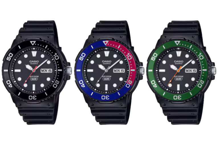
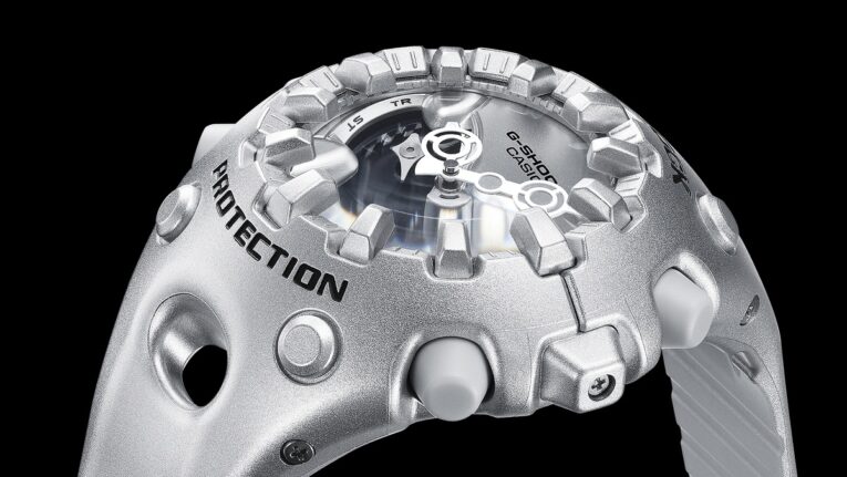
Casio MRW-230H diving-style analog resin watches available for pre-ordering

Casio MRW-230H diving-style analog resin watches available for pre-ordering Casio MRW-230H Diving Style Watch with Rotating BezelThe new Casio MRW-230H looks like what a traditional diving-style G-Shock would probably look like if it existed. (There is the G-Shock Frogman diving series, but we’re talking about a traditional dive watch with a rotating bezel.) The MRW-230H has a dimpled band and a rotating timer bezel made of aluminum. It measures 47.9 x […]

​G-Central G-Shock Watch Fan Blog 

Read More 

Posted on

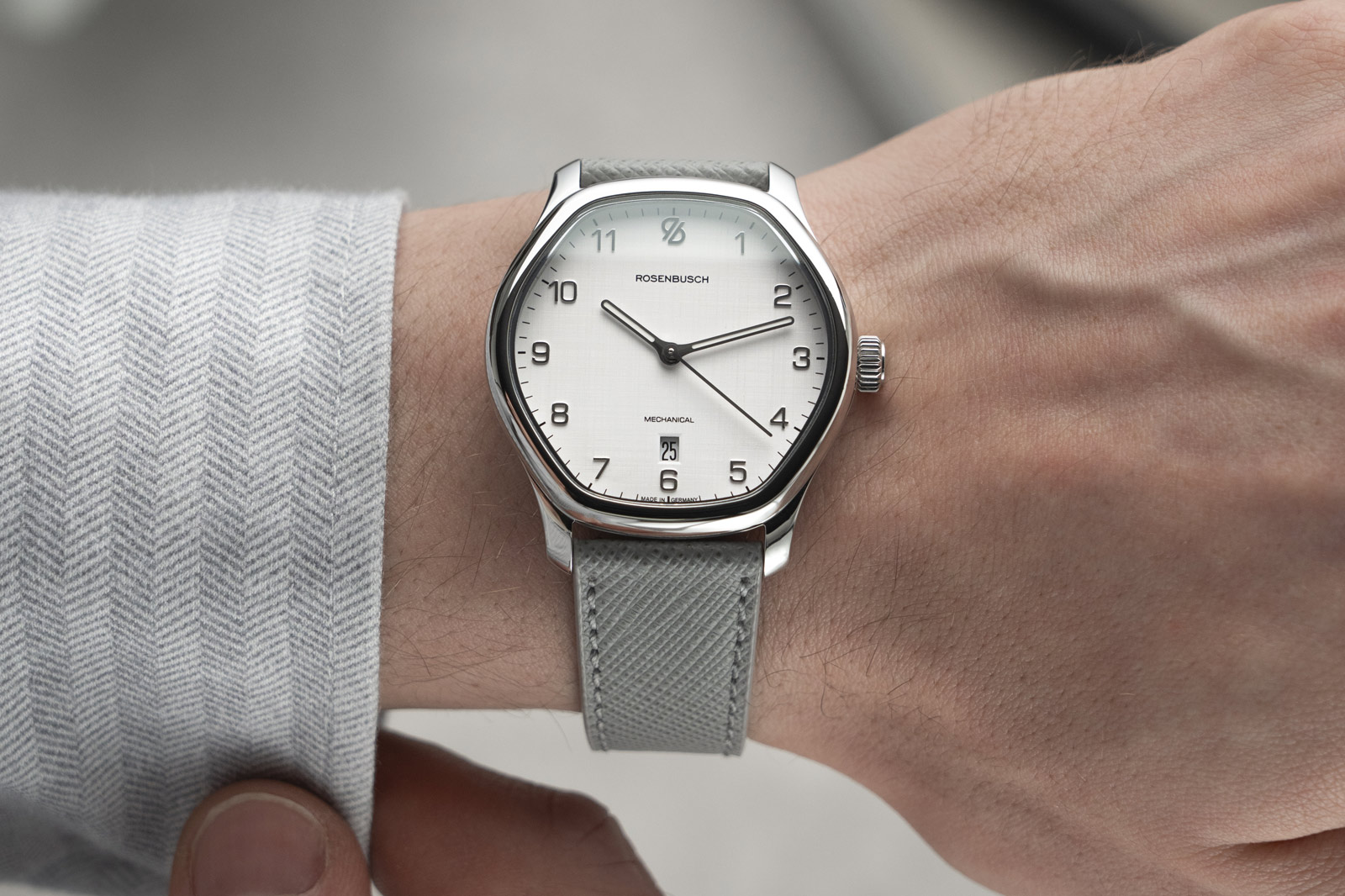
The Rosenbusch Horizon Offers Accessible Dress Watch Style in a Hexagon Case

Rosenbusch Horizon Canvas White

Rosenbusch Horizon Canvas White

Rosenbusch are a German microbrand who kicked things off confidently a few years ago with The Quest wristwatch, a modern reinterpretation of classic 1970s integrated sports watch design featuring a curved, hexagonal dial. For their latest release, they’re riffing on that hexagon shape in even stronger fashion while at the same time taking it in a completely different aesthetic direction. The Horizon is one of the most distinctive dress watches I’ve seen in a long while – coming to Kickstarter on March 4th.

Starting with the case, the Horizon measures 39.5mm in diameter in stainless steel with a thickness of 8.1 at the edges and 9.8mm the centre of the curved sapphire crystal. Here the case itself is fully hexagonal with rounded corners in contrast to The Quest, which had a round case with a hexagonal bezel and dial. By slimming the design down to just the polished hexagon, the Horizon feels dramatically more refined, especially around the lugs which are no longer in the integrated style.

Rosenbusch Horizon Black Pearl

I’m trying to think of iconic dress watches with unusual case shapes like this and there really aren’t a huge number. There are a handful of ellipses, retro TV style shapes and (perhaps most common of all) cushion designs but even then, none of them capture the distinctive smooth angularity of the Rosenbusch Horizon’s hexagon. Plus, with 100m water resistance and an accessible price tag, the Horizon is practical enough to be a daily wearer if you don’t fancy saving it for formal occasions.

There are four version of the watch being produced and each of them has a completely different interpretation of the dial, with a variety of finishes, colours and hour markers on display. First up is Black Pearl, which has a Musuo Black dial with applied indexes coated with lume. Musuo paint absorbs 99.5% of light giving it an incredibly dark appearance like the void of a black hole. It’s essentially an accessible alternative to the Vanta Black used by haute horology brands like H. Moser. This edition also does away with the 6 o’clock date window present on the other three.

Rosenbusch Horizon Copper Sun

Second is Copper Sun, which presents the Rosenbusch Horizon in salmon with a vertically brushed finish. It has the same set of indexes as the Black Pearl (am I the only one thinking about Pirates of the Caribbean with that name?) but here they’re presented in gunmetal grey instead of brighter silver. Next is Canvas White, a linen dial interpretation with Arabic numeral hour markers. As the name suggests, linen dials have a light cross-hatched style texture that emulates the texture of summer fabrics.

Rosenbusch Horizon Urban Blue

The last of the four designs is Urban Blue, the least dressy of the quartet. It’s denim blue with a vertically brushed centre and stepped hour scale with Arabic numerals. Matching the dial, it’s on a denim style strap to complete the casual, urban explorer vibes. Although it’s not as if there’s no precedent for luxury denim watches after Patek Philippe created their own ode to denim with the Ref. 5980/60G.

Rosenbusch Horizon

Inside is the Sellita SW210, visible through an exhibition caseback. It’s a manual winding piece with 45-hour power reserve and accuracy of +/-7 seconds per day. It also has Sellita’s elaboré grade finishing with straight line Côtes de Genève across its plate. Thanks to it being a manual piece, there’s no rotor to obscure the view either, giving you full access to admire its inner workings.

The Rosenbusch Horizon is available on Kickstarter from March 4th at a price of €875, a 30% discount from its final retail price which will be €1,250 (approx. £725/£1,035). For a steel dress watch with a manual elaboré movement and a diverse array of finishing and colour options, that’s great value. Whether you’re a fan of Musou, linen, denim or salmon dials, there’s something here for everyone, all wrapped up in that distinctive hexagon case.

Price and Specs:


Model:
Rosenbusch

Horizon

Case:
39.5mm

diameter x 9.8mm thickness, stainless steel

Dial:
Black

Pearl, Canvas White, Copper Sun or Urban Blue

Water resistance:
100m

(10 bar)

Movement:
Sellita

calibre SW210 Elaboré, manual winding, 19 jewels

Frequency:
28,800

vph (4 Hz)

Power reserve:
45h

Functions:
Hours,

minutes, seconds, date

Strap:
Fabric,

leather or denim

Price:
€875

(approx. £725) on Kickstarter, €1250 (approx. £1,035) (RRP)

More details at Rosenbusch.

​Oracle Time 

Read More 

Posted on

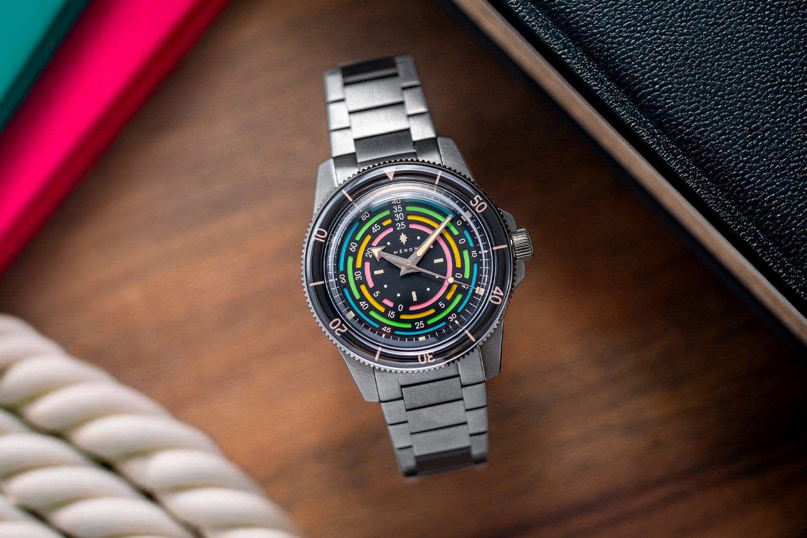
The Héron Marinor Rainbow is the Ultimate Value Proposition Decompression Timer

Héron Marinor Rainbow

Héron Marinor Rainbow

Confession time, I like decompression timer watches. They’re a fun niche within what is already one of the most prominent watchmaking niches, dive watches. If you’ve not come across one before, they’re a style of dive watch that features a circular table in the centre of the dial that displays information related to how long you have to spend on decompression stops when resurfacing from a dive in order to prevent the bends. Microbrand Héron have released their interpretation of this archetype with the launch of the new Héron Marinor Rainbow.

Straight away the thing that sticks out to me is the value. This is the first decompression timer I’ve seen in the past five years or so with a sub-£1,000 price tag. The Mido Ocean Star Decompression Timer 1961, Delma Retro Shell Star and Christopher Ward C65 Super Compressor Elite are all in the £1,000 – £1,500 bracket while the Marinor Rainbow is £510 on steel bracelet and £460 on rubber strap. You might expect then that it’s got less impressive specs but that’s not the case.

Héron Marinor Rainbow

Said case measures a well-proportioned 39mm x 12.9mm (including crystal) in stainless steel with a 300m water resistance rating. This is a better water resistance rating than both the Mido and Christopher Ward, meaning the Marinor Rainbow actually outperforms the pricier pieces. I also personally think that it’s got a much cleaner and more legible display than its rivals as well.

In the centre is a 12-hour display (my one irk being that the hour hand extends past it instead of pointing to it), around which is the rainbow decompression timer. Decompression timers are difficult to get right because they have to display a lot of information in a relatively small area meaning they can look cluttered and difficult to read. The Marinor Rainbow avoids this by employing a bold, graphic style.

Héron Marinor Rainbow

Wherever a number is noted, there’s a black gap in the recessed, sandwich rainbow scale providing strong contrast to the white numerals, ensuring they’re legible. The black areas also provide a clear visual break where there’s a change in decompression timing required. Héron actively acknowledge they were inspired by heritage models from brands like Mido, so they’ve evidently studied and made their own improvements. That all said, I should probably explain how the scale works.

The numbers on the bridge at 12 o’clock denote the depth at which you are swimming in metres. You then follow the relevant scale clockwise for the amount of time in minutes you spend at that depth. Where you intersect with a number on the scale, that number denotes how much time you need to spend on decompression stops when resurfacing. You’ll note that the first numeral on each of the scales is a 0, meaning that if you spend less than that amount of time at that depth, a decompression stop is not required.

Héron Marinor Rainbow

Outside the decompression timer is a 60-minute scale and beyond that we get to the unidirectional bezel with 60-minute timer. You can use the bezel in conjunction with the decompression table to stay safe while diving. When you’re starting your stop, rotate the bezel so that the arrow lines up with the minute hand to mark its starting point and track elapsed time easily regardless of what the local time is.

Héron Marinor Rainbow

Beneath the rainbow dial is housed the Miyota 9039 automatic movement with 42-hour power reserve. This is the area where the Marinor Rainbow is maybe a bit behind its rival decompression timers because Christopher Ward uses a COSC movement and the Mido has an 80-hour power reserve. However, I think the Miyota movement is perfectly acceptable given the price of the watch, which to reiterate is about half that of the rivals we’ve been comparing it to. Need I say impulse buy?

Price and Specs:


Model:
Héron

Marinor Rainbow

Ref:
3301-A

Case:
39mm

diameter x 12.9mm thickness, stainless steel

Dial:
Two

layer sandwich with rainbow decompression scale

Water resistance:
300m

(30 bar)

Movement:
Miyota

calibre 9039, automatic, 24 jewels

Frequency:
28,800

vph (4 Hz)

Power reserve:
42h

Functions:
Hours,

minutes, seconds, diver decompression scale

Strap:
Stainless

steel bracelet or black FKM tropical rubber

Price:
£460

(rubber strap), £510 (stainless steel bracelet)

More details at Héron.

​Oracle Time 

Read More 

Posted on

10 Types of Watch Numerals Every Watch Enthusiast Should Know

Types of Watch Numerals

Types of Watch Numerals

If your knowledge of wrist-worn time stems from the seventies, eighties, or nineties, you can read any watch from the mere position of your hand. But in today’s society, many of us think vital knowledge is becoming lost. Kids and Gen Z are used to seeing pure digital time readouts wherever they look, whether on a dashboard, coffee machine, iPad, or ever-hypnotizing smartphone screen. What then of watch numerals?

Arguably the digi-fication of the world might be one reason legible numerals are making a comeback, and Gen Z might get the urge to strap on an actual timepiece. Roman or Arabic, applied or printed numerals might remove some elegance from suitably minimal dress watches. But done right, the right numerals complete a good design. So we’ve carefully curated a collection of some of the most important, oft-copied styles out there and will happily champion literal legibility for all.

Roman Numerals

Chopard Alpine Eagle 41mm Cadence 8HF

Nothing spells out traditionalism like a well-executed Roman numeral in a slim, crisp-printed font. It’s an aesthetic known from the earliest 18th-century pocket watches. As the oldest way of marking numbers, keeping them on watch dials is perhaps the only way to ensure their lease of life in the onslaught of smartwatches and screens. But who does it best? And how does it translate to a modern aesthetic?

Many brands use the classicism of the slender markings to their advantage, often to designate their dressier models. Cartier has a clear shot at the title in terms of range proliferation. Even when they had a punt at the diver’s market with the odd Calibre de Cartier, Roman numerals were front and centre.

Moritz Grossmann and Ferrier offer great examples of sliver-thin Roman style for the slenderest applications. As for the more challenging design brief of applying the classicism of Roman numerals to a sports watch, the Chopard Alpine Eagle offers the quirky cool of the 41mm Cadence 8HF with its buzzing 8hz Chopard 01.12 high-frequency escapement and orange details.

Sandwich Numerals

Panerai Luminor Tre Giorni PAM01628

While less of a typographic style and more of a technique, sandwich numerals nevertheless have a distinctively macho place in watch design. All numerals are cut into the dial, while a lumed sub-layer creates a charming sense of depth and a suffused glow in low-light situations. It’s a style that’s been used in a few places over the years, but one that’s impossible not to talk about without mentioning Panerai. Every Pammie has a very clear identity, and most brand CEOs would give an arm and a leg for the elusive 10-foot recognition a Radiomir or Luminor gets, even if it comes with a polarizing cachet.

The sandwich dial speaks for itself, and with it Panerai has, to some watch lovers’ chagrin, taken their three watch shapes to the peak of Big Watch Noughties and back down again. But with a love of tech and material innovation, there is reinvention, despite the refusal to release a single sub-40mm circular watch, or heavens forbid, a rectangle. But that is exactly why the Paneristi stay loyal and refuse to bow to the trends of small, dressy wristwear.

Breguet Numerals

Breguet 5177

Louis Breguet and his namesake brand have created one of the strongest legacies in the business and know how to remind us about it. Curvaceous numerals in a classical sans-serif font are par for the course and have set a typographical standard. With Breguet numerals, a watch designer can choose to lean on a traditional language of design to ensure a clean result or contrast it with a modern case to great effect.

Breguet still has a way with its namesake typography, and we have a soft spot for the luscious, platinum version of the pared-back design of the 5177, with slender silver numerals that appear to hover above the glass-like enamel darkness. A good set of Breguet Arabic numerals allows the space to shine and, to some minds, look best when left undisturbed by a date window. Given their slender nature, they are more than a delicate match to a suave set of feuille or even spade hands.

Bauhaus

Nomos Tangente Neomatik 39

German watchmaking has an architectural quality, especially visible in the mid-century modernity of their home-grown mid-priced brands that cater to the taste of the very same architects. Where many brands put all their chips on sport and dive watches, the 1920s Bauhaus school of design has a fervent following for its clean graphic aesthetic. The tall, narrow typography is also well known from 1920s Art Deco artwork in illustrations and poster art, and you’ll recognize a Nomos watch dial from the slightest macro detail of a slim, minimalist numeral.

Typically, the Bauhaus numerals are accompanied by a matching font and a matte dial where the Germanic strict focus on functionality shines through. Due to the thin nature of the typography, the print needs to be crisp and of high quality, with a distinct balance of proportions between numerals and hands. Frivolities are reined back for the sake of legibility, and it brings with it a clean-cut charm that’s hard to replicate.

Oversized Arabics

Longines HydroConquest

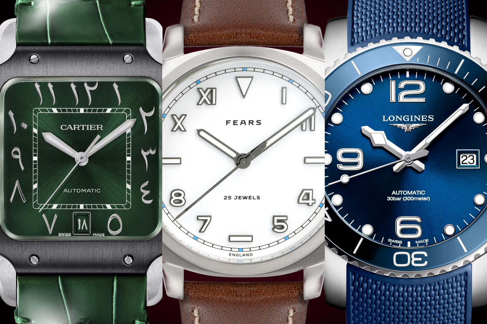
For sport and dive watches, the emphasis on legibility drives the design process, at least if the brand is serious about the potential adventures of its wristwear. To make time-telling easy, many go the Big Three route, where the 12, six, and nine numerals are charmingly oversized compared to the rest of the dial markers. Yes, there is also a number three on most dials, but a date window usually occupies its space for function-conscious buyers.

Great examples of big quadrant Arabics are the long-running Longines Hydroconquest series, while the big fit of the Panerai Luminor comes with a Sandwich version of the same, with their tell-tale running seconds at nine o’clock. But for maximum effect, look at the wide, squat dial-dominating six and 12 on a Chopard Mille Miglia, a racing-inspired design that’s been a staple of petrolheads for more than 20 years.

Size Variation Within the 12 Numerals

F. P Journe Linesport Centigraphe

With the addition of date windows, registers, and sub-dials come inevitable legibility challenges. Most brand designers cut into the shapes of Arabic numerals unceremoniously or even omit them altogether. Very few brands choose a different route that keeps the circular string of 12 numbers intact, varying the actual size of the numeral font. One brand stands out in this respect, F.P. Journe.

As a brand known for its focus on legibility, its Arabic numerals have a wide stance and serifed curvature to the typeface. However, where other brands unceremoniously chop off a three or four for a date or omit a nine, Francois Paul scales them down and leaves them in place, as if hit by a shrink ray. Look at one of his dials and enjoy the vibrant dance of full-and half-size numerals with their serifed tails and curves intact, adapting to the cut-out shapes around them.

Eastern Arabic Numerals

Cartier Arabic Numerals

With the Gulf states and the U.A.E being an increasingly important part of the watch-buying scene, many brands have released special editions with the flourish of traditional Eastern Arabic numerals. You will often see the swirling typography combined with the colour green, and we have seen great examples of limited editions ranging from the Bulgari Octo Finissimo to Cartier’s Santos. The green colour holds many profound associations within Islam, embodying themes of paradise, purity, and prosperity.

Combining both colour and the flourish of the traditional font offers a vibrant contrast to the strict architecture of many watch designs, ranging in price from a mid-priced Frederique Constant to the angular Finissimo. Cartier went all out with a matching green alligator strap and a rich green sunburst brushed dial and, with its rarity, found many Western buyers wanting a touch of far-Eastern vibrancy.

The California Dial (Arabic/Roman)

Fears Topper

The California dial refers to an odd mix of Arabic and Roman numerals, as if a designer made a mock-up to see what made the best impression on the watch’s face. The storied and well-known progenitors of the genre are Rolex, and Rolex-manufactured Panerai watches from the 1930s, used by the armed forces in wartime Europe. The aim was to make a fool proof dial regarding low-light legibility, even though the style’s functional purity, if perhaps aesthetic mess, faded away after World War II.

It was resuscitated in a surprising Japanese boom of the heady eighties, but why California? Legend has it that Rolex could not keep up with demand, prompting a California-based manufacturer to refurbish Rolleys in the quirky style, hence the nomenclature. Today, it’s found in Panerai Radiomirs, on the Nomos Club Campus, and ironically on the California screen of the Silicon Valley pet, the sleek Apple watch. Possibly the coolest version in recent memory, however, comes courtesy of British brand Fears and their collaboration with Silicon Valley jeweler, Topper.

Handwritten

Frederique Constant x seconde seconde Slimline Moonphase

With collaborations and the blend of art and watches come fun details like handwritten scrawls on dials and seemingly handwritten numerals. We’ve seen some great examples this year. Notably, the end of 2023 released chocolate ceramic AP Royal Oak QP with rapper Travis Scott. With a cocoa-tinted textured strap and deep chocolate-coloured brushed ceramic, it might have been wildly polarizing. However, it stood out as an intensely interesting piece, with all numerals and text rendered handwritten, as crisp as only AP can.

Another notable release this year was the superlative fun of the Frederique Constant x seconde/seconde/ Slimline Moonphase. In a quiet year for the industry, it stood out with its irreverent take on the formal FC, indices strewn haphazardly on the dial. The moon itself is oddly non-circular, and the scrawled logo and dates of Romaric André come with the magic power of laughter.

Chinese Characters

Parmigiani Tonda PF Xiali Calendar

There is no denying China’s importance as one of the biggest markets in the world for wristwatches, even if 2024 saw a dip in sales in parallel with their housing investment market bust. The importance of the Chinese market has had two effects on Swiss main brands and the increasing might of the independents. One is the proliferation of colourful editions for each Chinese New Year and the emergence of Chinese characters on the dial.

It feels like a natural move and a sign that the Swiss are adapting to a changing world, and for the prolific collectors out there, most brands do a mix of Roman numerals and Chinese characters to appeal to Western eyes as well. But one of the best combinations of colour and Chinese typography was the Parmigiani Tonda PF Xiali Calendar, a QP with a vibrant red guilloche dial and a full set of Chinese characters and numerals.

​Oracle Time 

Read More