Posted on

Beaucroft x Penfold Limited Edition for British Watchmakers’ Day 2025

Beaucroft x Penfold Limited Edition

Beaucroft x Penfold Limited Edition

After the resounding success of the inaugural British Watchmakers’ Day last year hosted by the Alliance of British Watch and Clock Makers, it’s no surprise that the show is back again for 2025. If you managed to attend last year, you’ll know the coolest aspect of the event is that each of the exhibiting brands rock up with British Watchmakers’ Day limited edition watches exclusively available at the show. With the 2025 edition just around the corner, taking place on March 8th, we’re starting to see a handful of those limited editions be announced, such as the Beaucroft x Penfold Limited Edition for British Watchmakers’ Day 2025.

Beaucroft x Penfold Limited Edition

Penfold is the alias of Bristol-based artist Tim Gresham, who is known for his striking use of abstract shape and colour to create motion and emotion. It has long been the ambition of Beaucroft to work with him on a project and the Watchmakers’ Day limited edition offered the perfect opportunity. Regarding the project, Penfold said, “When Matt [Herd, Beaucroft Co-Founder,] first spoke to me about designing a watch for Beaucroft I initially had something wild and loud in my head. After playing around with ideas and compositions I found myself stripping back the elements and letting the watch speak for itself”

Beaucroft x Penfold Limited Edition

The result is a dial both elegant and dynamic. It has a matte white base to simulate a blank canvas, on top of which sits an airbrushed gradient bar with sharp shadow beneath. Accenting the bar is an engraved Beaucroft logo and an off-centre black dot. There’s an interesting interplay between the straight, rigid lines of the bar and the curved surfaces of the dot and the fact that the watch itself is round.

Speaking of, the watch’s case measures 39.5mm in diameter with a thickness of 11.7mm in stainless steel. It has a mixture of brushed, polished and bead blasted finishing across the smooth bezel, case sides and angular lugs. It’s a pretty robust case too with 200m water resistance and an extra-hard coating to provide improved scratch resistance. Ideal for daily wear with an extra dose of artistic flair courtesy of that dial.

Beaucroft x Penfold Limited Edition

Powering the piece is an industry staple accessible movement, the Miyota 9039 with 42-hour power reserve and regulated to +/-10 second per day accuracy. It’s one of the most widely used calibre around and helps brands keep prices reasonable while also being reliable. The Beaucroft x Penfold Limited Edition for British Watchmakers’ Day 2025 is priced at £649 and only 75 pieces are available. They will be offered first exclusively to attendees of the British Watchmakers’ Day on March 8th with any unsold pieces available online from 9am on March 9th.

Price and Specs:


Model:
Beaucroft

x Penfold Limited Edition

Case:
39.5mm

diameter x 11.7mm thickness x 46.5mm lug to lug, stainless steel

Dial:
3

layered with linear gradient airbrushed applied metal artwork and angled outer ring

Water resistance:
200m

(20 bar)

Movement:
Miyota

calibre 9039, automatic, 24 jewels

Frequency:
28,800

vph (4 Hz)

Power reserve:
42

Functions:
Hours,

minutes, seconds, date, chronograph

Strap:
Stainless

steel bracelet

Price:
£649,

available at the British Watchmakers Day Event on 8th March

More details at Beaucroft.

​Oracle Time 

Read More 

Posted on

Panerai Submersible QuarantaQuattro Mike Horn Edition PAM01676 Is Adventure Ready

Panerai Submersible QuarantaQuattro Mike Horn Edition PAM01676

Panerai Submersible QuarantaQuattro Mike Horn Edition PAM01676

Panerai have been working alongside adventurer Mike Horn for over two decades and in that time they’ve collaborated on plenty of watches together. It was only last November they released the Panerai Submersible GMT Titanio Mike Horn Experience Edition which comes with a trip to Bhutan included. Speaking of trips with Panerai, they’re offering an Oracle Time reader a free trip to Watches & Wonders 2025, make sure to sign up before January 31st for a chance to win. But for now, let’s talk about the new Panerai Submersible QuarantaQuattro Mike Horn Edition PAM01676.

Kicking things off, the watch is a pretty standard rendition of the steel Submersible QuarantaQuattro in the signature colours of the Mike Horn special editions. That means it has a 44mm diameter cushion case with the signature crown protection lock at 3 o’clock. It also has a ceramic insert bezel with uni-directional rotation that makes it nice and scratch resistant while you’re calculating your immersion time. Scratches are somewhat inevitable on a dive watch due to the hostile environments of the sea and beaches, full of nasty rocks and sand that are basically unavoidable, so any extra scratch resistance is welcome.

Panerai Submersible QuarantaQuattro Mike Horn Edition PAM01676

The core colours here are blue and yellow. As mentioned, these are colours common to virtually  all Panerai Mike Horn watches. Blue is representative of their shared love of the seas and yellow makes sense as a high contrast colour to blue, making it nice and legible even in low light conditions. Another Swiss brand, Doxa, famously tested a lot of colours for dive watches to find the most legible and they settled on orange, but yellow achieves essentially the same thing. Plus, in the deep dark of the ocean, most colours fade to brown or grey at best anyway. At least without a torch to light them up. The yellow accents are found on the watch name, 300m water resistance marking and small seconds subdial.

I really like the use of small seconds subdials on dive watches. The smaller diameter of the subdial means it’s easier to see that the hand is moving, which is proof that the watch is still working as intended and that the movement is running. That’s why you’ll often see small second counters on dive watches referred to as running seconds. When you’re relying on your watch to keep you safe, you want to be certain it’s operating normally.

Panerai Submersible QuarantaQuattro Mike Horn Edition PAM01676

While we’re still focusing on legibility, the Submersible QuarantaQuattro Mike Horn Edition PAM01676 is fitted with the classic dive watch array of applied hour markers coated with lume. Panerai are more famous for their sandwich dial designs but here safety and practicality win out over style. Which is as it should be for a professional instrument. Beneath the surface of the dial is the P.900 calibre, a Panerai staple with 3-day power reserve.

As for price, the Mike Horn edition is £10,300, which is right around the price of the other ceramic bezel Submersible QuarantaQuattros. At its core this is an alternative colour scheme for the watch but it’s a scheme that really works with the eye-catching yellow paired with the serene blue. Also, one last reminder to take part in the Oracle Time x Panerai competition to win a ticket to Watches & Wonders 2025.

Price and Specs:


Model:
Submersible

QuarantaQuattro Mike Horn Edition

Ref:
PAM01676

Case:
44mm

diameter, stainless steel

Dial:
Blue

vertical brushed

Water resistance:
300m

(30 bar)

Movement:
Panerai

calibre P.900, automatic, 23 jewels

Frequency:
28,800

vph (4 Hz)

Power reserve:
72h

Functions:
Hours,

minutes, seconds

Strap:
Blue

rubber

Price:
£10,300

More details at Panerai.

​Oracle Time 

Read More 

Posted on

Richard Mille Go Rectangular with RM 16-02 Automatic Extraflat

Richard Mille RM 16-02 Automatic Extraflat

Richard Mille RM 16-02 Automatic Extraflat

Back in the autumn of last year Richard Mille announced they would be discontinuing the RM 032 with a swan song edition, which would remove the final circular case design from production. What that meant at the time is that once the 32 disappeared, it would be tonneau or bust when it comes to Richard Mille’s watches. However, before the age of tonneau supremacy could even begin, RM have announced the revival of a different non-tonneau model, the RM 016, with a new edition called the Richard Mille RM 16-02 Automatic Extraflat.

Richard Mille RM 16-02 Automatic Extraflat Terracotta Quartz TPT

Jumping right to the case, it’s rectangular. Specifically, it measures 36mm x 45.65mm, making it 10% smaller than the previous RM 016, improving its wearability. Which is a good thing too because it still carries a lot of wrist presence thanks to the long flanks and integrated strap, which makes the whole piece look like a continuous block of material. It’s as if an Apple watch has been genetically enlarged and turned mechanical – if that idea sounds like fun to you, check out the H. Moser Swiss Alp.

Richard Mille RM 16-02 Automatic Extraflat Titanium

The case itself is available in a choice of two materials. There’s the titanium edition with its sleek metallic surfaces or the terracotta quartz TPT edition. Quartz TPT is a silicon composite material that’s both incredibly tough and lightweight, great for dramatic cases like this. The terracotta colour is a little hit and miss, on the one hand I like the architectural vibe it gives to the piece, like a Boston Brownstone Mansion, on the other it’s a little hard to get excited about the colour of a brick.

Richard Mille RM 16-02 Automatic Extraflat Titanium

However, while the case is the thing that first draws you into this watch, what really captivates is the dial. It’s a fully skeletonised display that reveals the new CRMA9 Calibre that was developed specially for this watch. What’s interesting about it is the regularity of the skeletonization, as each small window through the plate is rectangular or square. It makes for a striking and unique appearance, like an angular maze.

Richard Mille RM 16-02 Automatic Extraflat Terracotta Quartz TPT

Describing the hour markers of this watch is incredibly difficult. Each numeral is made up of two parts, a traditional Arabic numeral index and a twisting line that runs around the edge of the dial, passing through each of the numerals. For example, at 12 o’clock, the 1 is entirely made of the line while the top part of the 2 is a traditional numeral but the horizontal line at the bottom is again the twisting line. 2 and 5 o’clock are in fact only made up of the line. It feels like someone’s played a game of Tron across the display, which makes me wish we had bright neon colours instead of the grey and brown we do have.

Richard Mille RM 16-02 Automatic Extraflat Titanium

Digging into the CRMA9 Calibre a bit more, it has a 50-hour power reserve with a baseplate and bridges made from titanium. It’s wound by a new platinum rotor with titanium weight elements that has a similar architectural angularity to it as the rest of the watch. It looks like a sci-fi steering wheel from a spaceship.

Richard Mille RM 16-02 Automatic Extraflat Terracotta Quartz TPT
Richard Mille RM 16-02 Automatic Extraflat Titanium

I think without question this is one of the most interesting watches Richard Mille have produced in a while, certainly since the RM UP-01. It’s a crazy mix of ultra-modern and futuristic design presented in a very traditional, grounded set of colours. It runs the full gamut from architectural foundations to sci-fi oddity in a nonsensical way. It’s not committed to being any one thing and I kind of love it for that. As with virtually all RMs, it’s price on request.

Price and Specs:


Model:
Richard

Mille RM 16-02 Automatic Extraflat

Ref:
RM

16-02

Case:
36mm

width x 45.65mm height x 9.5mm thickness, Terracotta Quartz TPT or titanium

Dial:
Skeletonised

Water resistance:
30m

(3 bar)

Movement:
Richard

Mille calibre CRMA9, automatic, 25 jewels

Frequency:
28,800

vph (4 Hz)

Power reserve:
50h

Functions:
Hours,

minutes

Strap:
Rubber

Price:
Price

on request

More details at Richard Mille.

​Oracle Time 

Read More 

Posted on

ÁIGI Satellite Ground Station II Brings Nordic Science and Horology Together

ÁIGI Satellite Ground Station II

ÁIGI Satellite Ground Station II

Back in the autumn we took a look at the top Scandinavian brands you should know about, exploring how Scandinavian design and horology intertwine. However, there’s one Norwegian brand who slipped through the net and are definitely worth a closer look, ÁIGI. They’re fascinated by Norway and the Arctic’s relationship with light and science, using it as inspiration for their timepieces. This concept is perfectly expressed in the new ÁIGI Satellite Ground Station II. Plus, who doesn’t love a bit of Nordic charm and this watch oozes with it right down to the brand’s name ÁIGI, which means ‘time’ in the language of the indigenous Sámi people of Scandinavian.

ÁIGI Satellite Ground Station II

As the inclusion of II in the name suggests, this is the second Satellite Ground Station series they’ve produced following the popularity of the first. The new watches, of which there are four designs, build on and develop the core concepts of the original series. First let’s break down the other part of the watch’s name. A satellite ground station is the Earthbound counterpart to satellites in space, sending and receiving information and instructions to and from spacecraft. Norway’s positioning at the top of the world makes it a prime location for scientific research bases, as well as satellite and radar arrays.

ÁIGI Satellite Ground Station II

Why is this relevant? Well, the dial of the ÁIGI Satellite Ground Station II is based these arrays. The black and blue dial editions have a tessellating pyramid pattern that’s inspired by radomes, the spherical structures made of the same pyramidic shapes that protect radar and satellite equipment. The gold and white models instead have a concave dial with radial engraved lines leading to each of the hour markers, a representation of the satellite dish itself. I actually prefer the subtler design of the satellite dish pair, perhaps because it reminds me a little of the Nivada Grenchen Antarctic Spider style dial design, which is another polar inspired timepiece though dedicated to the other end of the planet.

ÁIGI Satellite Ground Station II

As for the case, it’s based on 1980s integrated bracelet design. Which means it has a wide, flat bezel with notches at the cardinal positions giving it a faintly industrial look. Rather than being an actual integrated bracelet design though, ÁIGI have recreated the same aesthetic using traditional lugs that are angular with brushed surfaces. It makes it more versatile than an actual integrated watch as you can change the straps depending on the occasion. The case itself is well-proportioned at 39mm diameter and 10.2mm thickness, nice measurements for a sports watch. It also has 100m water resistance and a chemically hardened surface so it should be well-suited to everyday adventures.

ÁIGI Satellite Ground Station II

Beneath the dial of the ÁIGI Satellite Ground Station II is the Miyota 9039 premium automatic movement with a 42-hour power reserve. It’s a well-respected movement used by a huge number of brands for good reason, its -10/+30 seconds per day accuracy and perfectly reasonable power reserve are great value considering the price point it’s typically available at. Speaking of price, the blue, black and white editions are all $479 (approx. £390) and the gold version, which has a gold-plated dial, is $499 (approx. £400).

ÁIGI Satellite Ground Station II

All four colours are also limited editions of 500 pieces, making them fairly exclusive but not restrictive. Between the sporty cases, dials inspired by cutting-edge scientific technology and great value, there’s a lot to fall in love with here.

Price and Specs:


Model:
ÁIGI

Satellite Ground Station II

Case:
39mm

diameter x 10.2mm thickness x 46mm lug to lug, stainless steel

Dial:
White

or gold concave or blue or black satellite antenna inspired pattern

Water resistance:
100m

(10 bar)

Movement:
Miyota

calibre 9039, automatic, 24 jewels

Frequency:
28,800

vph (4 Hz)

Power reserve:
42h

Functions:
Hours,

minutes, seconds

Strap:
Stainless

steel bracelet

More details at ÁIGI.

​Oracle Time 

Read More 

Posted on

Casio America releases MWA300H metal-covered full analog chronograph for under $70

Casio America releases MWA300H metal-covered full analog chronograph for under $70 Casio MWA-300H Chronograph Full Analog with Stainless Steel BezelCasio America released the Casio MWA300H chronograph series, which was previously released in Asia (MWA-300H) in December. The three debut watches have a full analog display with a large case, stainless steel bezel, and resin band. Although the dial looks similar in appearance to the upscale G-Shock GMC-B2100, this is more of a pure chronograph […]

​G-Central G-Shock Watch Fan Blog 

Read More 

Posted on

Farer Relaunch GMT Bezel Collection with Returning Favourites and New Designs

Farer GMT Bezel Maze Blue

Farer GMT Bezel Maze Blue

Maze Blue

There are a lot of fantastic British combinations out there. Bangers and mash, baked beans and cheese, Farer and GMT complications. Considering that the brand is literally named after the word for traveller, it should be no surprise that the archetypal travel watch function is the brand’s signature. Now they’re releasing a new GMT Bezel collection, reintroducing the series after a two-year hiatus with brand new designs. They’re the Maze III, Crooms III, Maze Blue and Charlton Green.

As is always the case with Farer watches, each of the four pieces in the collection have wildly different details but the same base design. But here they’re actually split further than that as there’s two 40mm versions and two 38mm versions, providing even more variety and choice than normal. The larger models are the third-generation models, so the Maze and Crooms, while the 38mm are the fresh-faced new designs in the Maze Blue and Charlton Green.

Farer GMT Bezel Charlton Green

Charlton Green

Despite the difference in size, the designs of the Farer GMT Bezel case are broadly the same with classy round shapes, boxed sapphire crystals and sapphire insert bezels. The bezels have a bi-directional rotation allowing you to quickly adjust the time zone you are tracking. The primary update to the collection compared to previous iterations is the new lugs. They are now what are described as ‘ski-slope’ lugs, which means they have a concave curve to them that flicks up slightly at the bottom.

Right, now to break down the four different versions, starting with Maze III. This is one of the classic Farer designs at this point, hence it receiving a third generation. It has a white pearlescent dial with a grid pattern that makes the piece look like maths paper, charting a graph of your travels. The hour markers are dive watch style with applied circles, rectangles and Farer’s arrow at 12 o’clock. It works well because with 200m water resistance, taking your Farer GMT Bezel for a swim is not out of the question. The accent colour is light blue while the GMT Bezel has a day/night split between black and white, it also shows all 24 numbers in its scale.

Farer GMT Bezel Crooms III

Crooms III

Next is Crooms III, another returning classic with its burgundy, sunray brushed design. Here the hour markers are swapped out for bar indexes in the majority of positions and Arabic numerals at 9 and 3 o’clock. The bezel is completely black and only displays every other hour as a numeral in the 24-hour scale. I really like this model; it has a richness to its colour that feels dressier and more refined compared to the playful Maze.

Moving to the 38mm models and their brand-new designs, we have the Maze Blue. As you might expect this is a variation on the theme of the Maze III, where the square grid pattern has been swapped for a honeycomb one. The name Blue comes from the blue day/night portion of the GMT bezel as well as the blue GMT hand that points to it. The other accent colour here is bright orange, making it one of the most vibrant pieces in the collection.

Farer GMT Bezel Maze III

Maze III

Last but by no means least is the Charlton Green. It has the same honeycomb pattern as Maze Blue but in warmer cream tone. It also has a unique GMT bezel with dot markers between the Arabic numerals. The facetted hour markers with blue strips down the centre are also unique to this model. The green in its name comes from the teal day/night indication on the bezel. Of the two 38mm models, this is my preferred model, which is shocking because I’m a lover of all things orange. The pale blues and greens mixed with the cream of the dial feels like a truly original colourway that I’ve not seen before.

Farer GMT Bezel

All four variants of the Farer GMT Bezel collection house the Sellita SW330-2 Top Grade movement, visible through the exhibition sapphire caseback. It’s a really solid movement with 56-hour power reserve, which is great for travel. It’s also weekend proof, just about, so if you put it down on Friday evening it should still be ticking on Monday morning. All four GMT Bezel watches also share a price of £1,350 with an optional £190 steel bracelet based on the 3-link design introduced in the field collection.

Price and Specs:


Model:
Farer

GMT Bezel

Case:
38mm/40mm

diameter x 12.5mm thickness, stainless steel

Dial:
White,

burgundy or cream

Water resistance:
200m

(20 bar)

Movement:
Sellita

calibre SW330-2, automatic, 25 jewels

Frequency:
28,800

vph (4 Hz)

Power reserve:
56h

Functions:
Hours,

minutes, seconds, date, GMT

Strap:
Rubber

or stainless steel bracelet

Price:
£1,325,

additional £190 for stainless steel bracelet

More details at Farer.

​Oracle Time 

Read More 

Posted on

G-Shock DW-6900TR for series anniversary is inspired by DW-6900H ‘Thrasher’ Series from 1995

G-Shock DW-6900TR for series anniversary is inspired by DW-6900H ‘Thrasher’ Series from 1995 G-Shock DW-6900TR for DW-6900 30th Anniversary: DW-6900TR-1, DW-6900TR-4, DW-6900TR-9G-Shock U.K. unveiled the upcoming DW-6900TR series, which celebrates the 30th anniversary of the iconic DW-6900 line. Also known as the “Triple Graph,” the DW-6900 evolved from 1994’s DW-6600 and inherited its case and “Fox Fire” EL backlight. The series became a staple in streetwear culture and garnered many fans in the worlds of sports […]

​G-Central G-Shock Watch Fan Blog 

Read More 

Posted on

Greubel Forsey Hand Made 2 Showcases 5,000 Hours of Craftsmanship

Greubel Forsey Hand Made 2

Greubel Forsey Hand Made 2

The idealised image of watchmaker is one of a slightly eccentric mad scientist who, loupe in hand, carefully pores over the inner workings of a watch with precision tool in hand. Who, with the utmost care and attention, uses antique machines to finish and refine each individual component. The reality of modern watchmaking is that a lot of these jobs have been supplanted by machines, but Greubel Forsey is determined not to let the old ways die. That’s why they’re proud to introduce the new Greubel Forsey Hand Made 2.

This is the second watch in their Hand Made series, the first of which was a tourbillon. The new piece does away with the spinning cage in favour of a more refined and, frankly, more practical complication instead: a power reserve indicator. Before we get to that though, when looking at this watch, whether the case, dial or visible portions of the movement, the first thing you have to understand is that 96% of it was crafted by hand by a single watchmaker. Only elements such as the sapphire crystal, jewels, gaskets, spring bars and mainspring were machined (and most of those because they’re physically impossible to achieve by hand).

Greubel Forsey Hand Made 2

Looking at the case, it’s beautifully crafted in white gold with brushed flanks and polished lugs. While Greubel Forsey have intentionally kept the specs of the case obscured so that we focus on the watch as a piece of artistry rather than a mechanical object, Hodinkee’s keen investigation reveals it measures 40.9mm in diameter by 12.8mm thickness. That feels about right for this watch, large enough to match the bold, almost industrial design of the dial without straying too far in the other direction to become cumbersome or chunky.

Greubel Forsey Hand Made 2

My description of the Hand Made 2’s dial as quasi-industrial comes from the fact that it’s partially openworked without being skeletonised. There are simply large windows in the frosted German silver plate that reveal elements of the inner workings. Plus, there’s the fact it features a dial-side balance spring at 7 o’clock, whose constant motion can’t fail to draw the eye. In the aperture above the power reserve indicator at 10 you can see a large conical jewel. The jewel itself rotates and depending on its positioning, that’s what translates the stored energy of the barrel into the indicator hand to give a numerical output.

Greubel Forsey Hand Made 2

Elsewhere on the dial we have thermally blued hands and Grand Feu enamel scale for the hours, minutes, seconds and reserve indicator. Because you know, all the hand-crafted mechanical elements weren’t enough, so they had to throw enamel into the mix as well. One benefit of the power reserve indicator is that we can be certain the watch has a 72-hour reserve, which is supplied via manual winding.

It feels like a lot of existing Greubel Forsey designs but the attention to detail and finishing has been taken to the next level again. Although you’d certainly hope that’s the case given each watch takes 5,000 hours to complete and Greubel Forsey are only capable of making two to three pieces each year. The Hand Made 2 really is the Rolls Royce Coachbuild of the watch world.

Price and Specs:


Model:
Greubel

Forsey Hand Made 2

Case:
40.9mm

diameter x 12.8mm thickness, white gold

Dial:
Grand

Feu enamel

Water resistance:
30m

(3 bar)

Frequency:
21,600

vph (3 Hz)

Power reserve:
72h

Functions:
Hours,

minutes, seconds, power reserve indicator

Strap:
Leather

Price:
Price

on request, limited to 2-3 pieces per year

More details at Greubel Forsey.

​Oracle Time 

Read More 

Posted on

Daniel Roth Extra Plat Souscription Explores a Legendary 1990s Time Only Design
Daniel Roth Extra Plat Souscription

Daniel Roth Extra Plat Souscription

Since it was revived a couple of years ago by the LVMH group, the reinvented Daniel Roth brand has steadily been paying homage to the original watches of its namesake brand. If you’re unfamiliar, Daniel Roth is the 1980s-1990s eponymous brand of legendary independent watchmaker Daniel Roth, known for his use of the double ellipse case shape. He created several variations of the design and now the modern Daniel Roth is following in his footsteps one watch at a time. We now have the Extra Plat Souscription.

Daniel Roth Extra Plat Souscription

If you’re keeping track of the historical Daniel Roth models that have inspired the modern brand, the original Tourbillon Souscription was released in 1989 as the debut watch for the brand. The Extra Plat Souscription is then inspired by a watch that launched only a year later in 1990, the 2107/C107, the brand’s first time only ultra-thin watch. Of course, the modern watch and its inspiration aren’t a one-to-one match because the aim of Daniel Roth today is to modernise the designs with updated specifications thanks to the cutting edge horology of the La Fabrique du Temps Louis Vuitton manufacture.

Daniel Roth Extra Plat Souscription

What that means is it has the same updated double ellipse case as the Tourbillon Souscription that proceeded it. Dimensions of 38.6 x 35.5mm make it very svelte on the wrist and due to the absence of a tourbillon they’ve reduced the thickness to a sleek 7.7mm. Roth was famously a fan of ultra-thin concepts and indeed he can be linked to the popularity of ultra-thin watches in the 1990s just as Gerald Genta can be linked to integrated bracelets in the 80s.

Daniel Roth Extra Plat Souscription

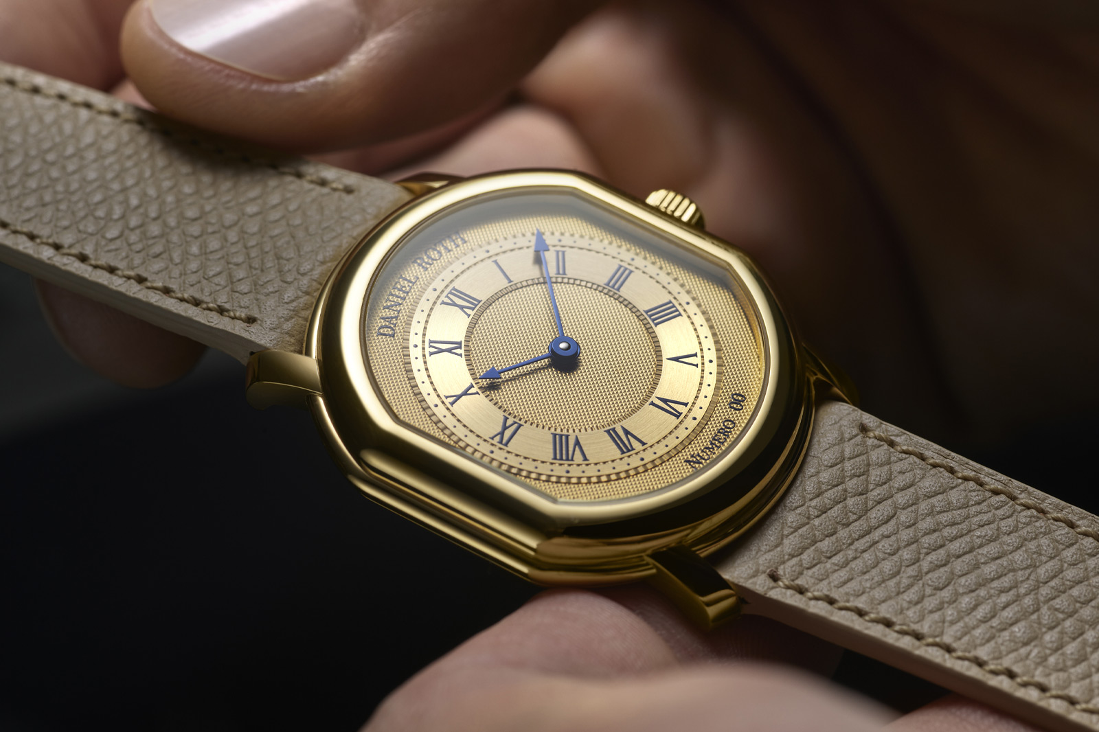
For the dial, they’ve gone for yellow gold to match the Daniel Roth Extra Plat Souscription’s case with a hand-engraved guilloché design. Specifically the central disk of the dial and the outer ring feature Clou de Paris, also known as hobnail, produced using an antique hand-operated straight-line engine. There’s then a second form of guilloché around the borders of the chapter ring with hour and minute scales, which is called filet sauté, a style of crimping.

Daniel Roth Extra Plat Souscription

The Roman numeral hour markers, logo and serial number are all printed in a rich blue colour, designed to match the tone of the thermally blued hands at the centre of the piece. The hands themselves are surprisingly minimalist with simple arrow tips, functional and smart. No extravagant Breguet hands here or shapely, carefully wrought feuille designs.

Daniel Roth Extra Plat Souscription

Inside the watch is a brand new movement, the DR002, the second bespoke movement created for the brand at La Fabrique du Temps Louis. It has a 65-hour power reserve, which is great, and operates at a 4Hz frequency. More than that it’s also beautifully finished with a combination of perlage, anglage bevels and Côtes de Genève. Although you unfortunately can’t admire the attention to detail without opening the solid caseback. Back in the day Roth did produce some of his watches with exhibition windows so perhaps the brand inspired by him will eventually do so too.

The Daniel Roth Extra Plat Souscription is limited to 20 pieces at CHF 45,000 (approx. £40,240). What’s perhaps even more exciting is that if it follows the same pattern as its tourbillon cousin, we may see a non-limited version released in the future, making Daniel Roth designs more accessible than ever. If you have a spare 40k lying around.

Price and Specs:


Model:
Daniel

Roth Extra Plat Souscription

Ref:
DBBE01A1

Case:
38.6mm

height x 35.5mm width x 7.7mm thickness, 3N yellow gold

Dial:
Clou

de Paris guilloche pattern

Water resistance:
30m

(3 bar)

Movement:
Daniel

Roth calibre DR002, automatic, 21 jewels

Frequency:
28,800

vph (4 Hz)

Power reserve:
65h

Functions:
Hours,

minutes

Strap:
Calfskin

leather

Price:
CHF

45,000 (approx. £40,240), limited to 20 pieces

More details at Daniel Roth.

​Oracle Time 

Read More 

Posted on

Tag Heuer Carrera Chronosprint x Porsche Rallye Watch Review

Tag Heuer x Porsche Carrera Chronosprint Rallye

Tag Heuer x Porsche Carrera Chronosprint Rallye

Car / watch partnerships can be a tricky proposition. Sure, they can be really cool showcases of automotive mechanics translated to the wrist, your Hublots, Jacob & Cos with their eye-wateringly pricey complications. On the other hand, the worst of them are nothing more than a limited-edition colourway and a lazily placed badge. The latest in Tag Heuer’s five-year partnership with Porsche is nicely in the middle, the Tag Heuer Carrera Chronosprint x Porsche Rallye.

I said five-year partnership, but it’s worth nothing that Tag Heuer and Porsche have worked together historically, too – at least, Porsche and Heuer (key difference) have. In fact, when the Porsche 911 made its competitive debut during the 1965 Rallye Monte Carlo, drivers Herbert Linge and Peter Falk would have read their necessary info off a Heuer dash-timer. So, when starting number 147 finished second in its class and fifth overall in the brutal, icy rally, despite not being a dedicated racer, it was in no small part thanks to Heuer.

Tag Heuer x Porsche Carrera Chronosprint Rallye

Obviously, the relationship continued tentatively across the years, such as in Le Mans (where Linge actually acted as a stunt double for Steve McQueen), but the last five years have made it a little more official.

The New Carrera Chronosprint x Porsche Rallye might not have downsized a 911 engine into a wristwatch, but between the two brands’ shared history there’s more than enough here to give the collaboration some weight. And the fact that it’s one of the loveliest versions of an already beautiful racing watch helps all the more.

Tag Heuer x Porsche Carrera Chronosprint Rallye

This isn’t the first Chronosprint we’ve seen; the model was debuted in 2023 in a handsome pair of classical models in rose gold or steel with pared-back, silver and beige dials. The bones here are the same, but the colourway is new, drawing the darker, high-contrast look of black with gold numerals from that 1965 Heuer dashboard clock. The red highlights on the other hand are taken from the livery of car 147 and there’s a good reason for them.

You see, the Chronosprint isn’t just another Carrera chronograph. While it does indeed work perfectly well as a stopwatch, the difference here is in the first 15 seconds. Look close at the bezel and you’ll see that the 15 is just short of where 6 o’clock would be. This is because the chronograph seconds hand races through those first 15 seconds before slowing for the rest of the minute.

Tag Heuer x Porsche Carrera Chronosprint Rallye

Philosophically, this apes the sprint of a Porsche 911, but there’s a practical purpose too. It means that you can time fractions of seconds for short times when everything after the decimal point actually matters, while allowing longer timekeeping for simpler stretches of road. It makes it a much more versatile chronograph. That said, I’m never going to use a chronograph for timing a race. I’d like to say I will and it’s nice to know I could, but I’m just not.

For me, that simply makes the Chronosprint one of the most satisfying complications to play around with – and I’m pretty sure a lot of you reading this can understand that. Seriously, watching the chronograph second hand sprint the highlighted red line (that incidentally follows the 9.1 second sprint of the original 911) is more fun that it has any right to be.

Tag Heuer x Porsche Carrera Chronosprint Rallye

The 42mm case sits nicely on the wrist with a thickness of 14.9mm. It wouldn’t stand out much if it weren’t for the double glassbox sitting on top, that really emphasises the shape of the watch in smooth, tactile fashion. I love the Glassbox. The Rallye is the Glassbox with a unique complication. Is it any surprise I love it?

The movement powering the whole thing is the TH20-08, with an 80-hour power reserve. Not too shabby at all. It’s also a looker, with copious Geneva striping and a (slightly on-the-nose) steering wheel shaped rotor. As you’d expect from this calibre (haha) of movement, it also has a good heft when engaging the chronograph. Anything else would be a travesty.

Tag Heuer x Porsche Carrera Chronosprint Rallye

So how does this stack up against last year’s debut Chronosprint? Well, there are two versions available, one in gold, limited to 11 pieces and the non-limited version in steel we have here. Honestly, the gold one seems a bit too flashy for a racing chronograph and the steel tones down those gold numerals and ‘Porsche’ lettering to make it more wearable. With 100m water resistance, the steel makes it a practical, everyday wearer, too. But even then, I still prefer the previous silver dials to the black.

The blacks arguably cooler, inarguably more modern and has a bit more going on than the more streamlined, vintage-feeling 2024 editions. And that’s precisely why, for me, it comes in second place – which given it’s Monte Carlo Rallye inspiration, is fitting. It is however the same price at £8,050 in steel and £21,150 in gold, so there’s not a lot in it. And while that’s a pretty hefty price even for a Tag Heuer chronograph, for a genuinely cool mechanical wrist on the stopwatch, paired with some genuine motorsport pedigree, it’s a price plenty of collectors will undoubtedly be willing to pay.

Price and Specs:


Model:
Tag

Heuer x Porsche Carrera Chronosprint Rallye

Ref:
CBS2015.EB0381

Case:
42mm

diameter x 14.9mm thickness, stainless steel

Dial:
Black

shimmery

Water resistance:
100m

(10 bar)

Movement:
Tag

Heuer calibre TH20-08, automatic, 33 jewels

Frequency:
28,800

vph (4 Hz)

Power reserve:
80h

Functions:
Hours,

minutes, seconds, date, chronograph

Strap:
Stainless

steel bracelet

Price:
£8,050

More details at Tag Heuer.

​Oracle Time 

Read More