
A watch is all about legibility, or at least that’s its original raison d’être, and nothing spells function more than a bright and legible index. In all good watch designs, types of watch indexes should work in glorious harmony with a pair of hands, letting you know the time at a quick glance. Sure, if you’re all about minimalism you might be sporting a small Cartier with a gloss black, unmarked abyss of a dial, but this is a story about clarity.
Whether you enjoy a sliver of lume or claw-like excess, a dial endowed with well-designed watch indexes can make or break a design. No matter how sculpturally they appear, they should offer the wearer balance and legibility. But then again, who doesn’t crave a gold-infused scene of 12 micro-engraved knights engaged in a lively debate under the crystal?
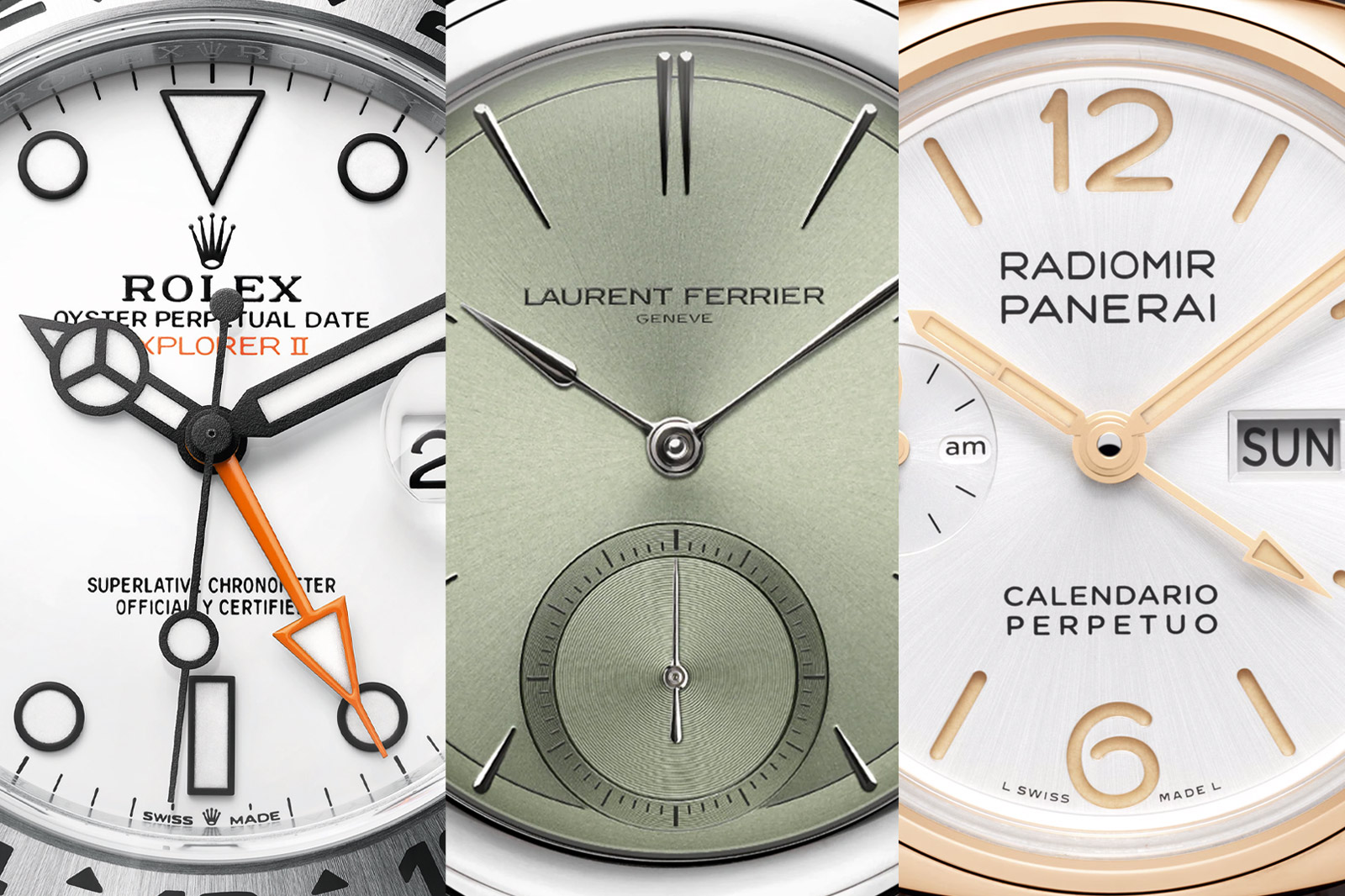
Baton

Most people’s definition of an index is probably the timeless baton shape and is the safe choice for many dial designs. Name your poison, but whether it’s flat, printed or applied with a dash of lume, it comes with a legibility guarantee. Choosing a favourite is not easy, but grab a loupe and check out the Heritage range of watches from Grand Seiko. You will find no other non-lumed index with better legibility, as each is hand-polished using the Zaratsu technique, with bevelled sides and often a discreetly striated top.
Spear

Each elongated 18K index, a type of watch index that is a smooth cross between a droplet and a spearhead, is utterly beguiling in its execution. For Laurent Ferrier, a brand invested in clean lines and spare design, it is about purity of line and a sense of zen.
Lumed

Rolex is known for its brand pillars, which are exquisite and oft copied like the Explorer II. Throughout its evolution from a cave-exploring tool to another sign of success, its nome de plume still emphasises clean legibility. There are a thousand homages out there, but none can better the crisp, black-framed indexes on the polar white dial. Cleancut monochrome doesn’t get much better than this, and the bright blue night-time pop of Chromalight lume is menthol fresh.
Hand-Painted

The Seiko top-tier Credor brand’s watches are slender, refined pieces of wrist architecture. The 50th Anniversary Eichi II is a jaw-droppingly gorgeous example of their hand-finished porcelain dials in a deep midnight blue. On the surface of the glass-like porcelain, each sliver-thin index is carefully hand-painted by a master craftsman in the brand’s Micro Artist Studio, the elite watchmaking workshop where the watch is crafted. After the dials are fired, gold is applied over the paint to create a warm three dimensional beauty that speaks an understated language of elegance.
Minimalist

The Malaysia-based watchmaker Ming Thein has a recognisably fresh approach to watch design, coming from a photography background instead of the world of horology. The 37.02 Minimalist, now designed and engineered in this new Swiss entity, has three concentric circles and a lack of indexes, or so it seems. The indexes are created in the 12 breaks of the triple circular patterns, which come across as accidental, but are in fact meticulously placed. This endows the engraved, lume-filled sapphire dial with a dark IYKYK vibe that becomes crystal clear when you get it.
Sandwich

Some dials are instantly recognisable from the smallest detail, and Panerai belongs to this exclusive club. Albeit large, a Panerai dial is known for its smooth, subtle markings of instant legibility. Indexes on a PAM are rendered within the negative space of a cut-out. From brawny Carbotech-divers to the sleek new 40mm Radiomir Perpetual Calendar GMT Goldtech, moody dark or sunburst dials come to life during the darker hours when the ethereal glow of lume creates an ethereal glow from beneath the dial surface.
Dive

Diver’s watches are about legibility in the murky depths, and budget brand Citizen has it nailed. They offer no-compromise functionality, with unmistakeably large indexes accompanying blunt sword hands. In the Orca Promaster, big legibility is taken to almost comical extremes, with the indexes growing organically from the rehaut in big, rounded shapes. They are uniquely cool and are only matched in drama by a massive set of white and red arrow hands with Mangalike drama in their design.
Triangle at 12

If you’re not into watches it will sound rather contrived to call a simple index iconic, and one which in its purest form might just be printed on a tool watch dial. But no single dial marking is more evocative and adventure-inspiring than a large, upside-down triangle shape at 12 o’clock.
This type of watch index, a lumed totem, has been present on most scratched-up diver and explorer’s watches since the 1950s. It spells adventure, legibility, and orientation, telling you what is 12 o’clock on a watch as you are rummaging about in a cave, or down the murky depths of Oceania. Or as with much wristwear, inspiring you to click on the checkout basket for that wetsuit you always promised yourself.
It’s worth noting that the famous KonTiki adventure watch from Eterna has a similar idea. Just on all cardinal points rather than just 12. Less effective practically, but aesthetically very cool.
Art Deco

Hajime Asaoka has a unique sense of design that echoes the decorative monochrome of the 1920s and Art Deco. This is distinctively prevalent in his haute horology pieces, where the indexes are perfectly positioned polished steel buttons. This is a vintage code we know from many Swiss brands, and now also featured in Asaoka-san’s latest venture, a revival of the Japanese Takano brand. They offer a crisp example of how well button indexes play alongside elongated baton shapes at the four quadrants of the dial, with the Asaoka trademark double index at 12 ‘clock.
H3 Gas

A solid dose of lume is all well and good, but nothing beats the incessant glow of Ball’s H3 tubes. Within the dial of the O.P-esque Engineer II Marvelight, it’s in the title, as 14 micro gas tubes light up after dark with a spectacular fireworklike show of legibility. Boasting 100 times the emitted light of a normal lume, the H3 micro gas tubes do not need charging up and will only deteriorate slightly over a period of years, lighting up your nighttime missions.
Architectural

If there was one watch brand that surprised us royally at this year’s Geneva Watch Days, it was Biver offering a newfound restraint. Normally, this word would not apply to a solid pink gold case and matching dial. But after last year’s debut with chime-tastic splendour, this was a welcome touch of restraint. The rich, textured monochrome of pure 18K pink gold is offset by a frankly gorgeous set of indexes with a totemic quality. Unusually rendered in anthracite Rhodium, and dramatically traversing the outer edges of brushed gold.
Abstract

The Roger Dubuis Knights of the Round Table Omniscient Merlin is more like a miniature gallery under sapphire than an actual watch. And it exhibits the most wildly flamboyant interpretation of the term index we know, perhaps of all time. In fact, these are not indexes, but solid 18K gold figurines of 12 knights, as if shrunk and cast in gold, forever trapped by the mighty Merlin. Each loupe attracting figure is hand-engraved and will cast a spell on its owner.
Oracle Time